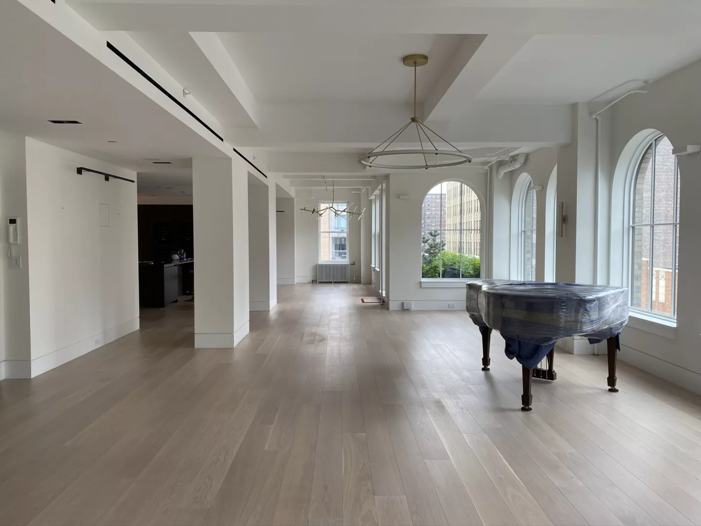
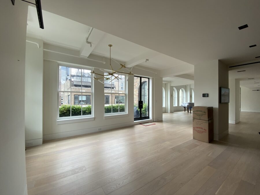
At our Chelsea Loft project, the client came to us with an adventurous design sense and an expansive, open-concept great room – in many ways a designer’s dream, albeit with one ‘problem’ area.
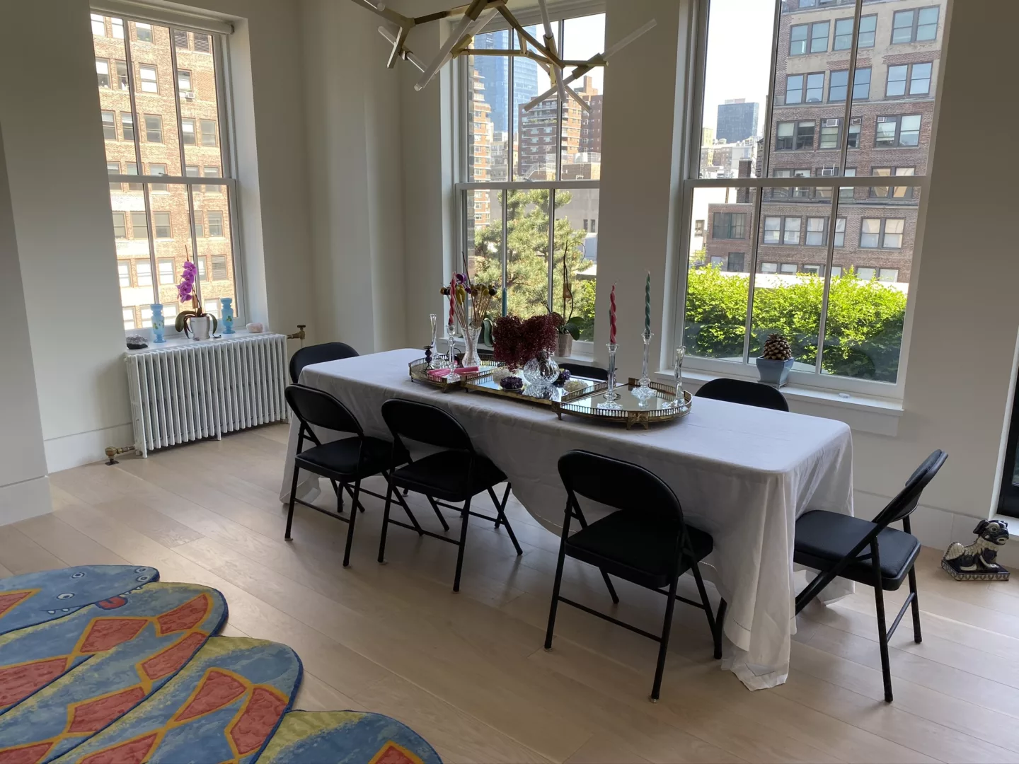
The secondary dining area, while ideal for morning coffee, is spatially compressed by interior columns and a door to the terrace. The layout left the client feeling perplexed… too sizable and visible to be treated casually, but too tight to function as a proper dining room. Unsure of how to use the space, the client temporarily settled on a folding table and a few chairs (until calling us in!).
Our solution? Three *seemingly* simple elements that add flow, function, and cohesion, while reflecting the homeowner’s ‘more is more’ personality. Here’s how it all came together.
Layout & Usage
When it comes to combining multiple functions in one space, we’re comfortably in our element, having tackled loft projects in Noho and Flatiron, and most recently, a double-height penthouse on the Upper East Side. “Though they may present as challenges, the idiosyncrasies of these spaces end up becoming real assets,” says Elena. “Solutions are found by changing our thinking and embracing spatial demands with a highly tailored, artful approach.”
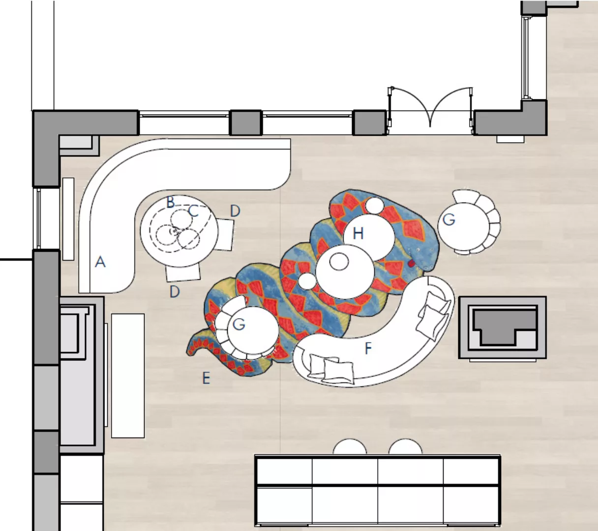
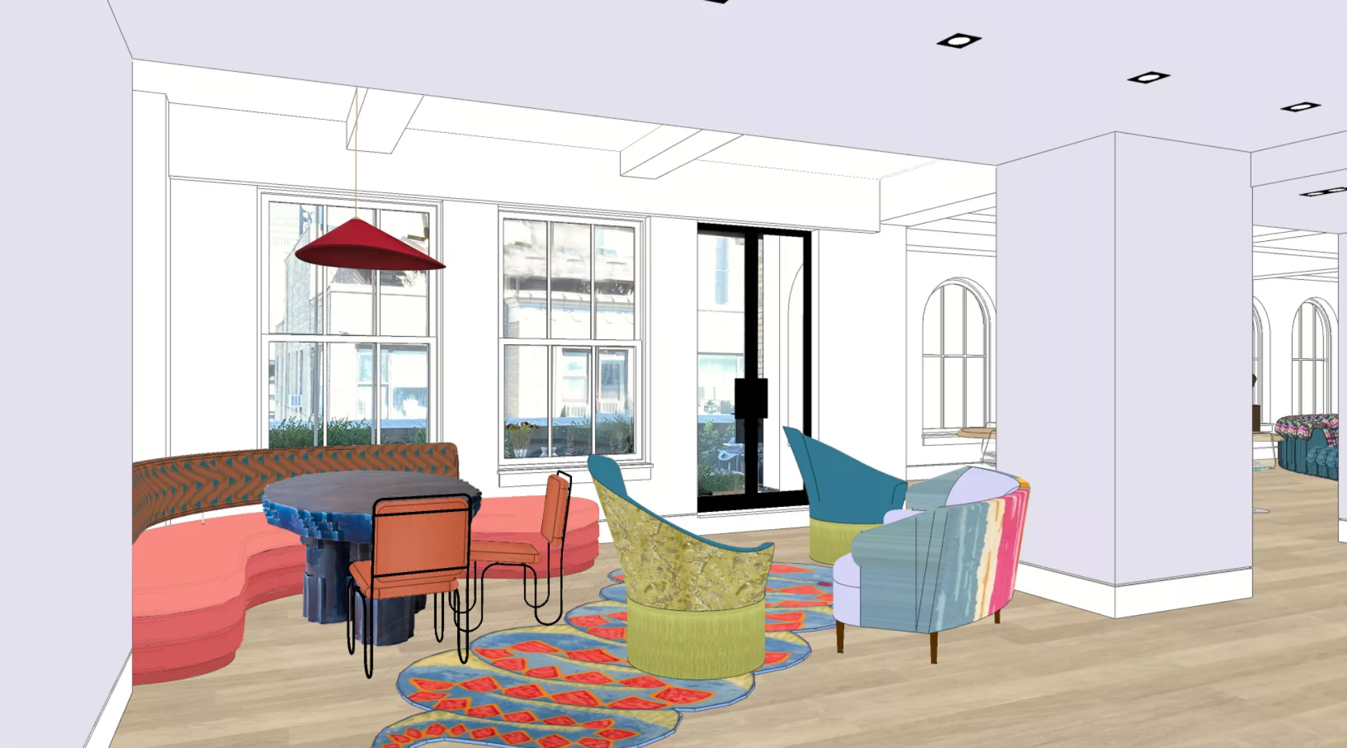
We leaned into the layout’s irregularity and multiple thresholds by honing in on the corner: window-clad on both sides with street and terrace views, and strong eastern light in the morning. Perfect for a built-in banquette. And just like that, a breakfast nook was born… conceptually, at least.
Form & Color Story
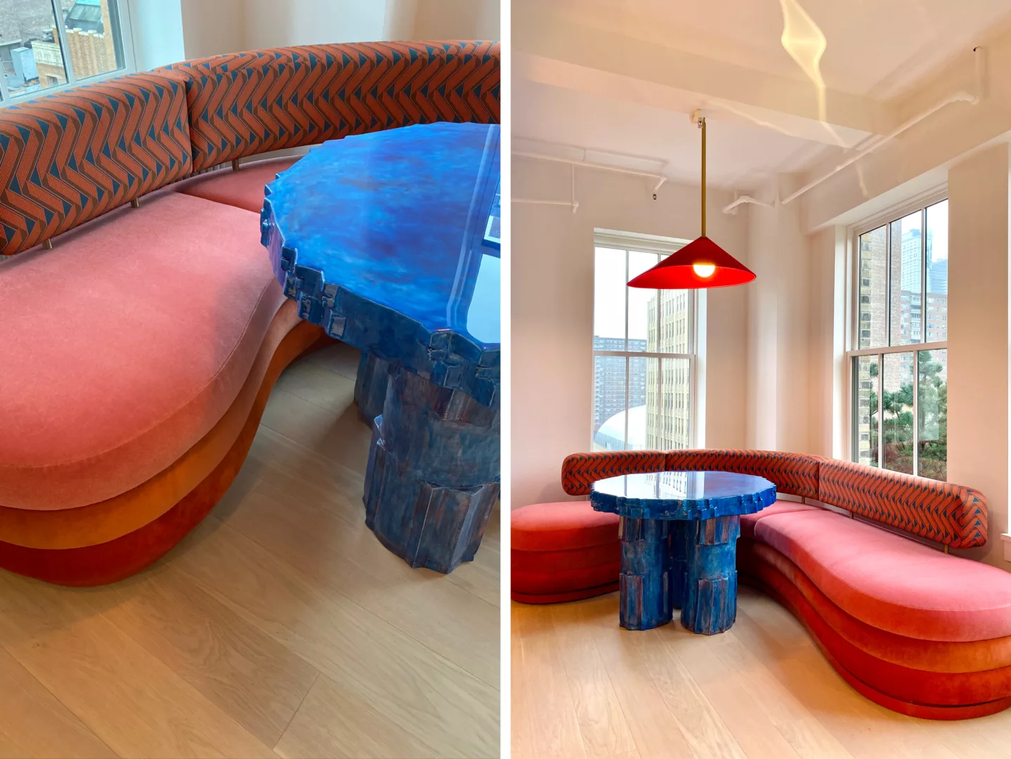
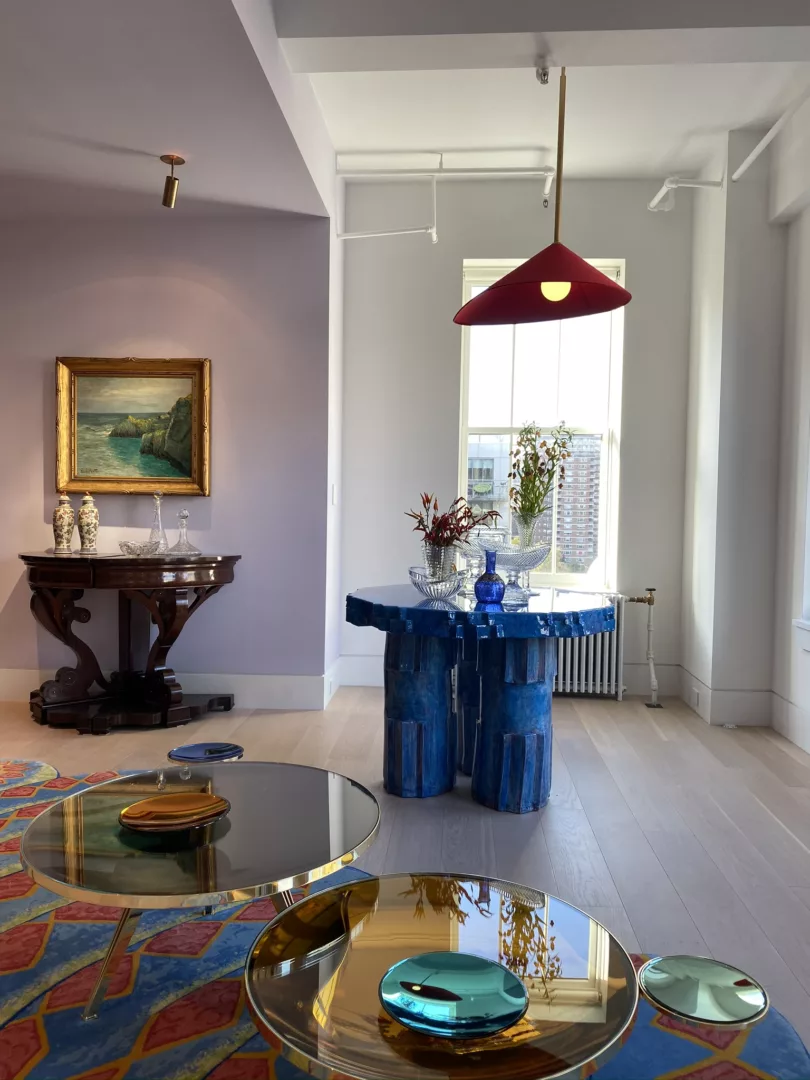
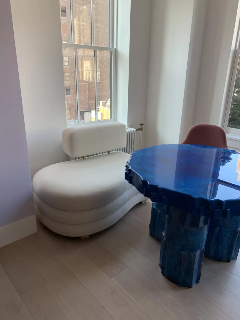
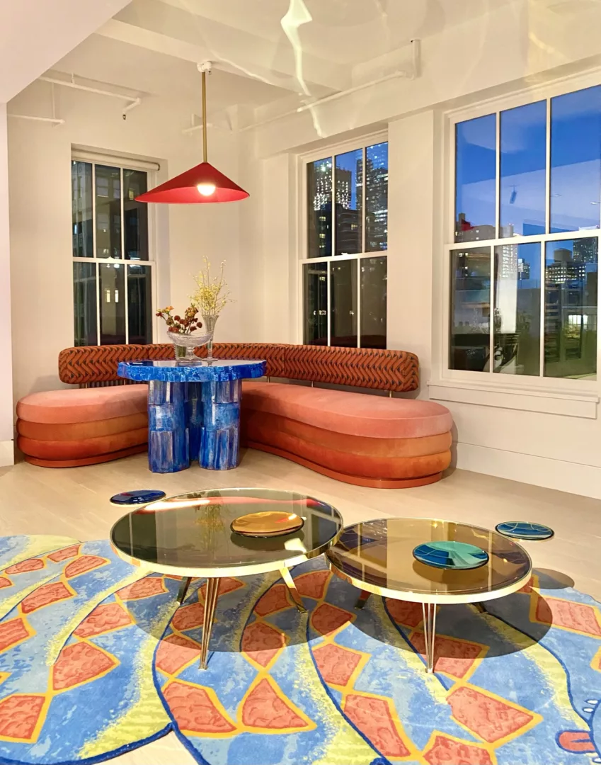
The design vision began with a sculptural “Twist” table by Amsterdam-based Studio Floris Wubben. The distinctive ceramic form was created with a combination of machine and handmade processes, offering a perfect balance of artful and functional. We commissioned the table in a custom blue resin finish echoing similar tones throughout the massive great room.
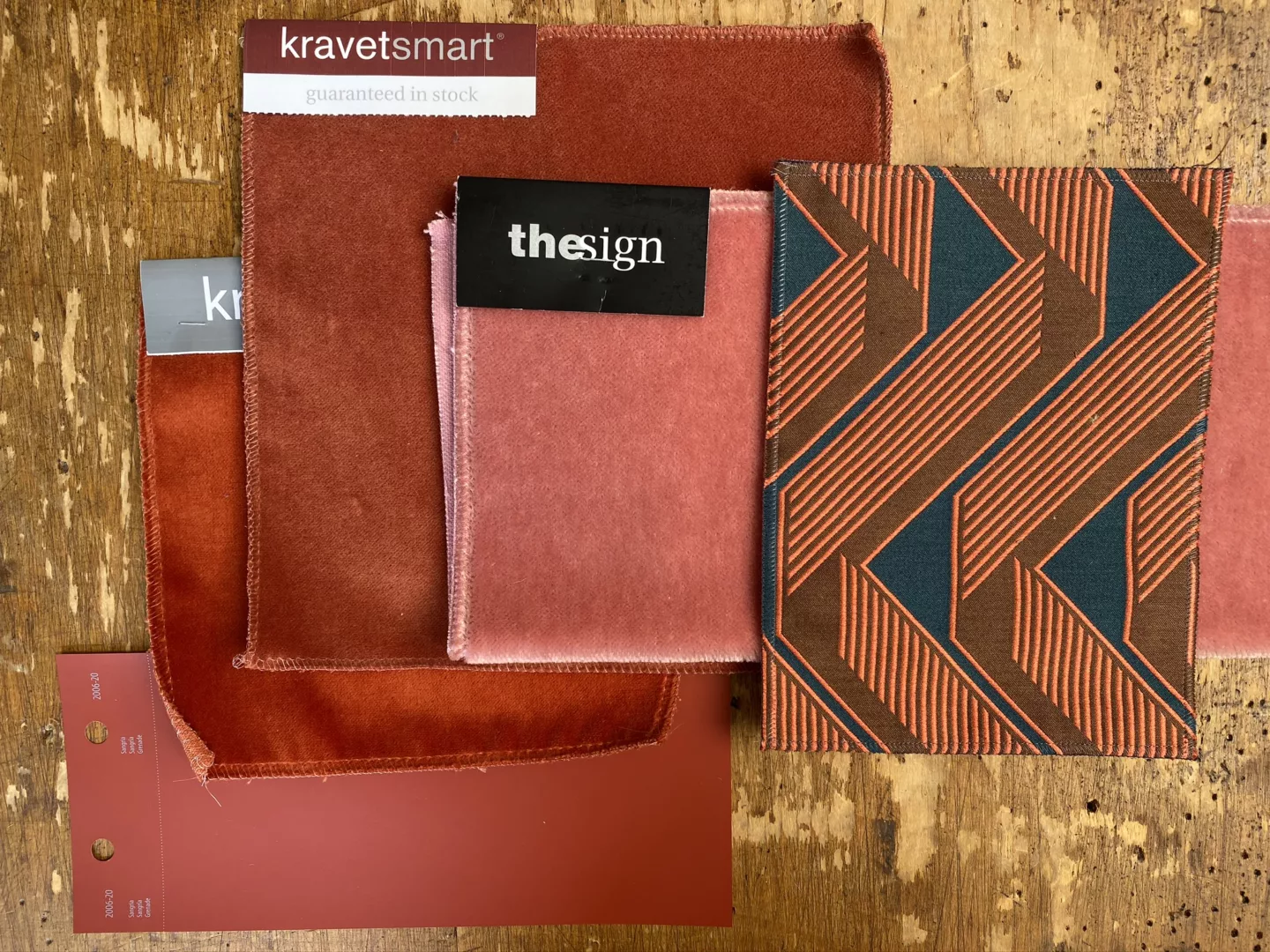
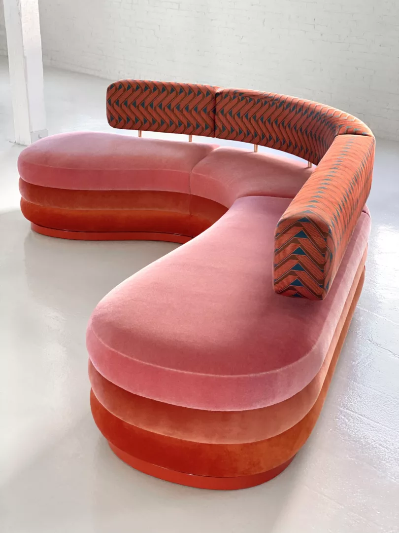
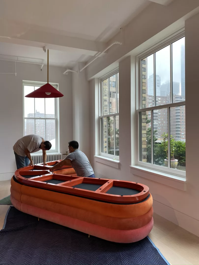
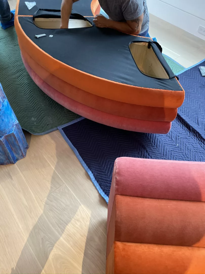
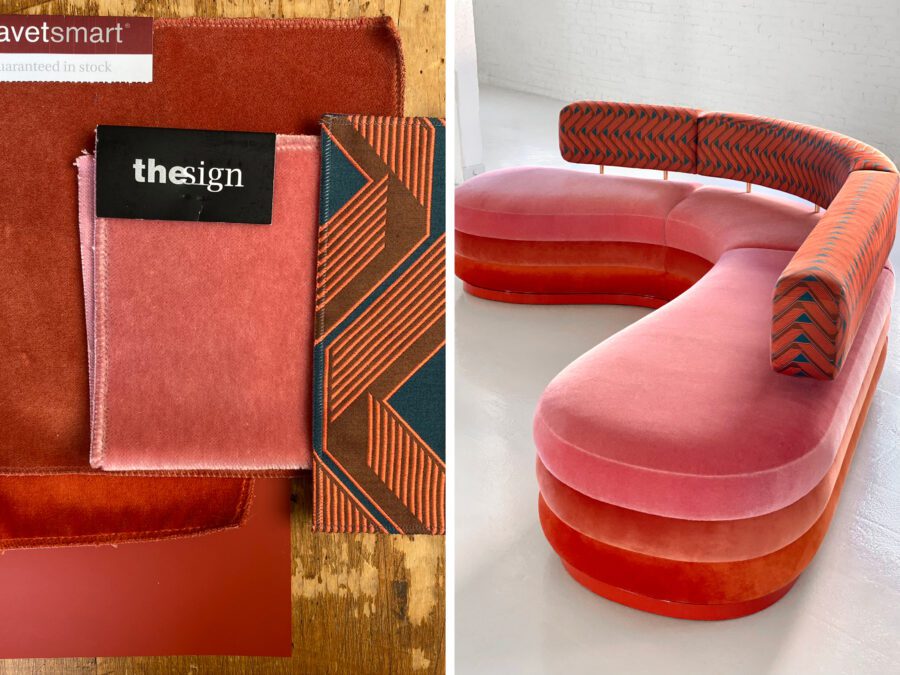
Turning our attention to the banquette, we worked with Dune to customize a curvy, L-shape sofa design. In contrast with the blue table, we conceived the upholstery in a gradation of oranges and reds. Composed of four horizontal channels, the banquette was upholstered in four entirely different fabrics: a red velvet base; coral velvet middle; blush velvet seat; and tangerine and navy zig-zag patterned back.
“Our job is to help clients go beyond their comfort zone,” says Elena. “Typically that means the unexpected, wild card option, or showing how bold ideas actually are very livable.” This particular client, an art collector with eclectic tastes, was exactly the opposite: seeking more layers, more color, more pattern, more everything. Our role was to create comfort with editing. With this in mind, we selected a pendant light by Daniel Nikolovski and Danu Chirinciuc. The asymmetrical, oversized red pendant is still bold, yet elegant in its simplicity.
Fine Tuning
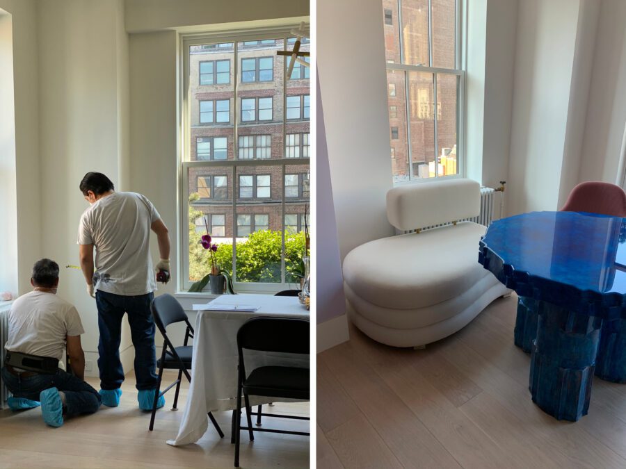
To be suitable for dining, the sofa required a few edits. Instead of the original attached back, we opted for a floating back that adds practicality (crumbs are real!), and visually breaks up the sequence of color and pattern (reading as ‘lighter’). The seat and back heights were adjusted to align with the table’s scale, ensuring a comfortable seat and visible back.
Before even starting production on the banquette, a cardboard table model was constructed to confirm the seat height to table proportion, as the one-of-a-kind table was atypical in size and thickness. A to-scale banquette sample was then created to experience in-home. Custom design is often achieved through a multi-step, try-and-test process. Nothing left to chance.
With each element carefully calibrated, the dining-area-turned-breakfast-nook went from mildly confusing corner to one of the home’s highlights, and what we might call a *maximalist success.*
