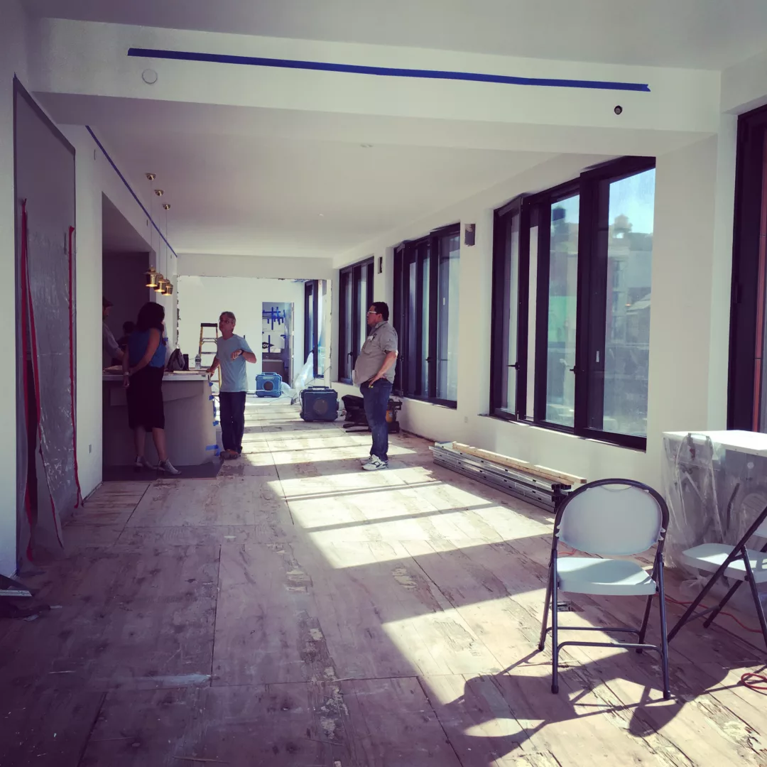
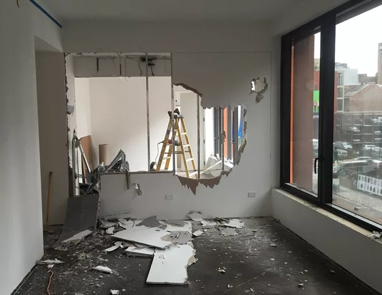
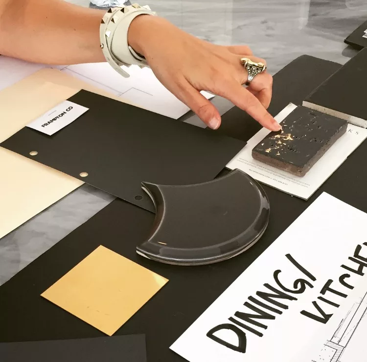
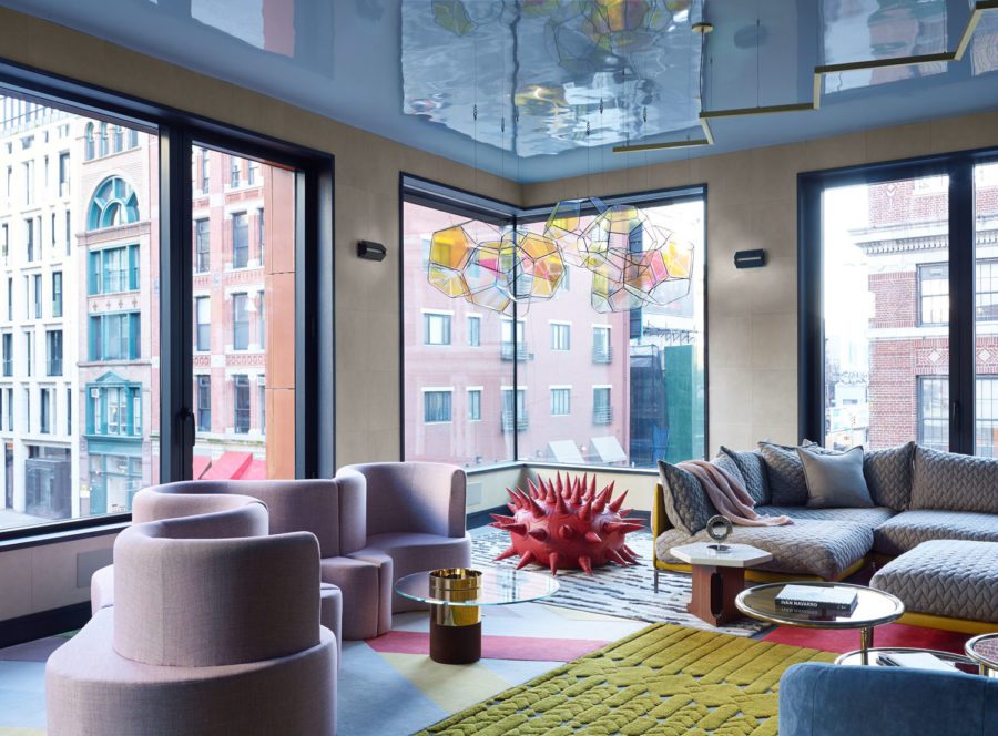
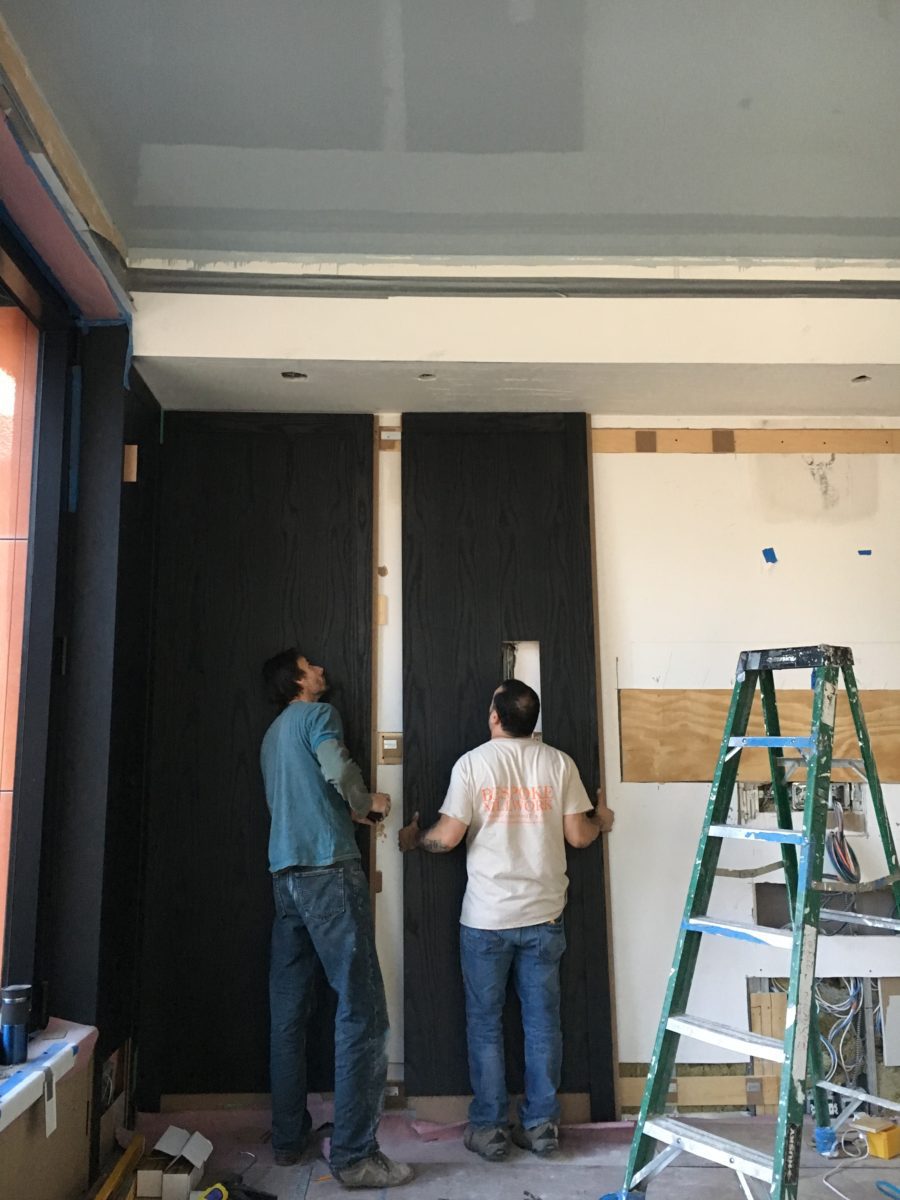
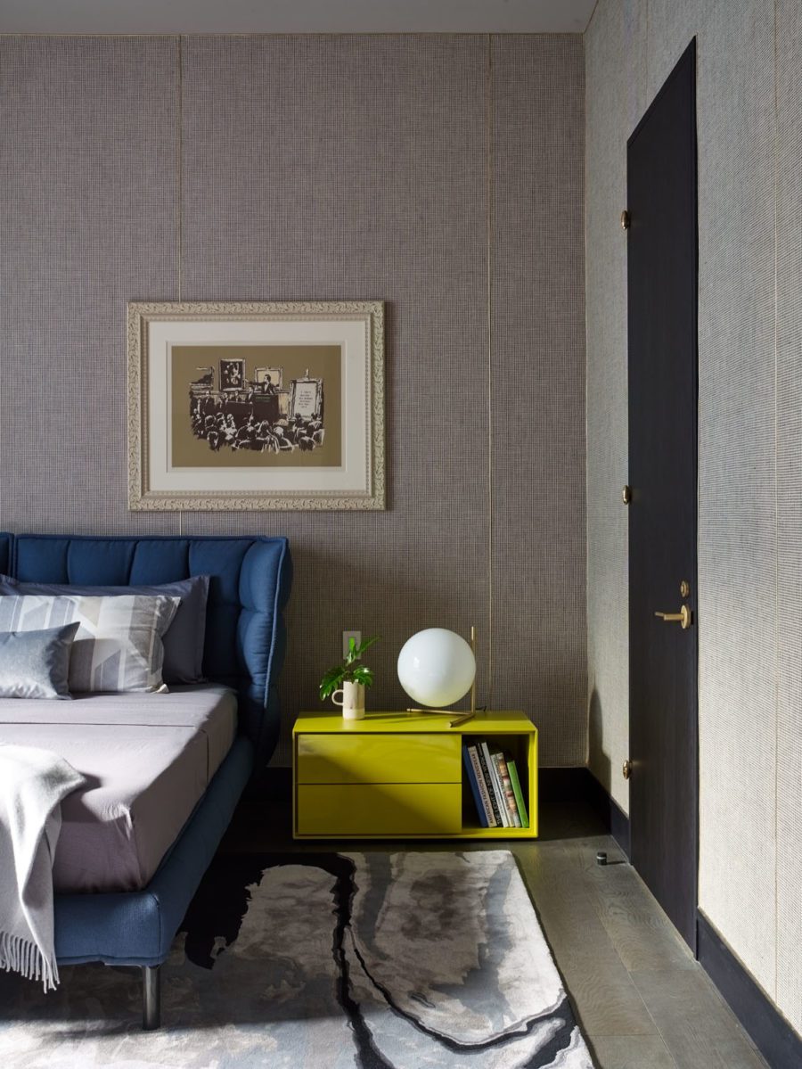
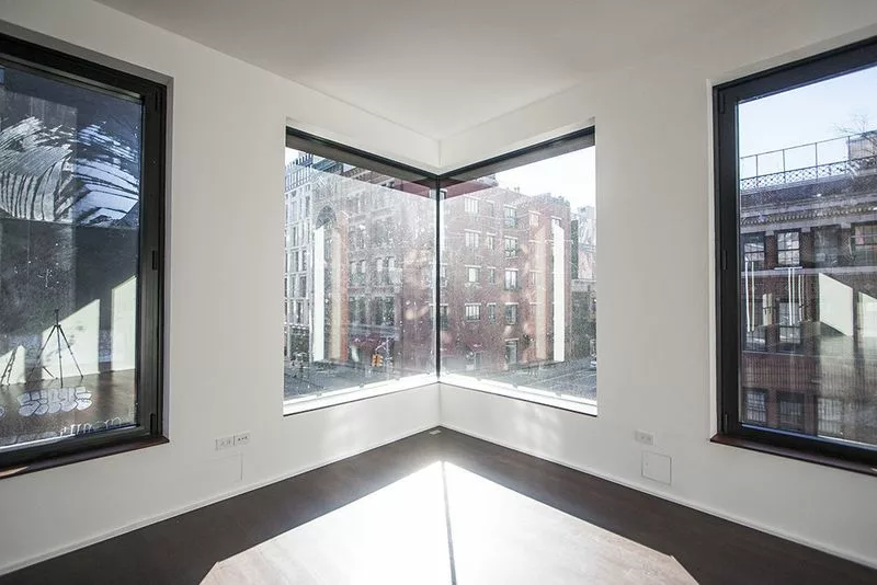
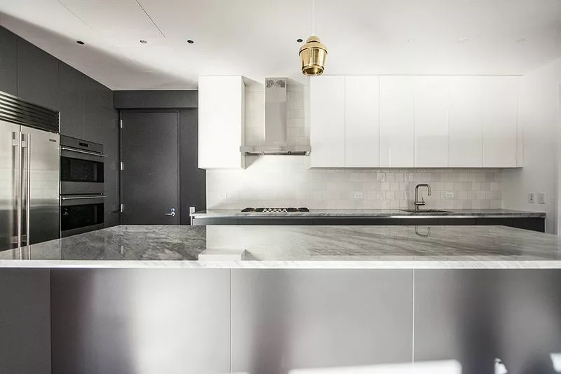
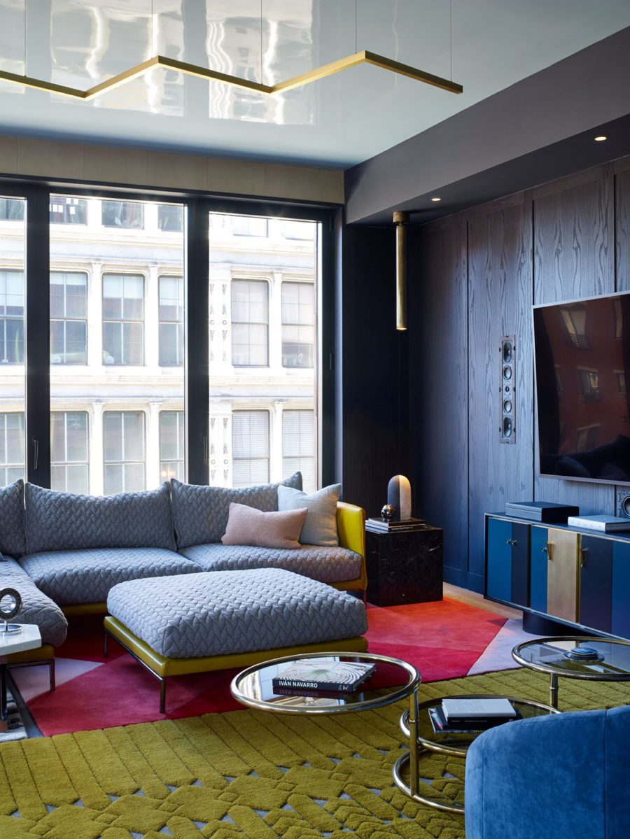
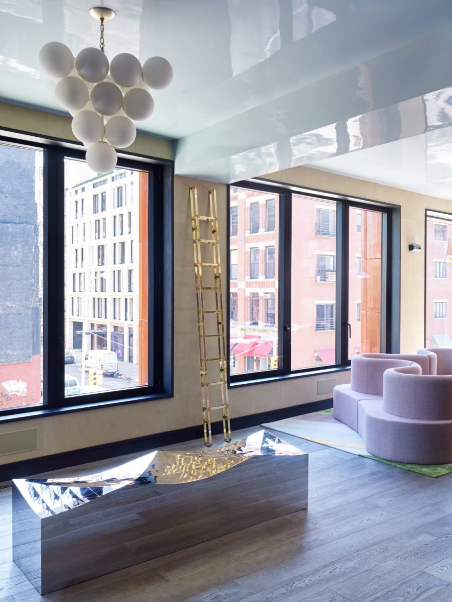
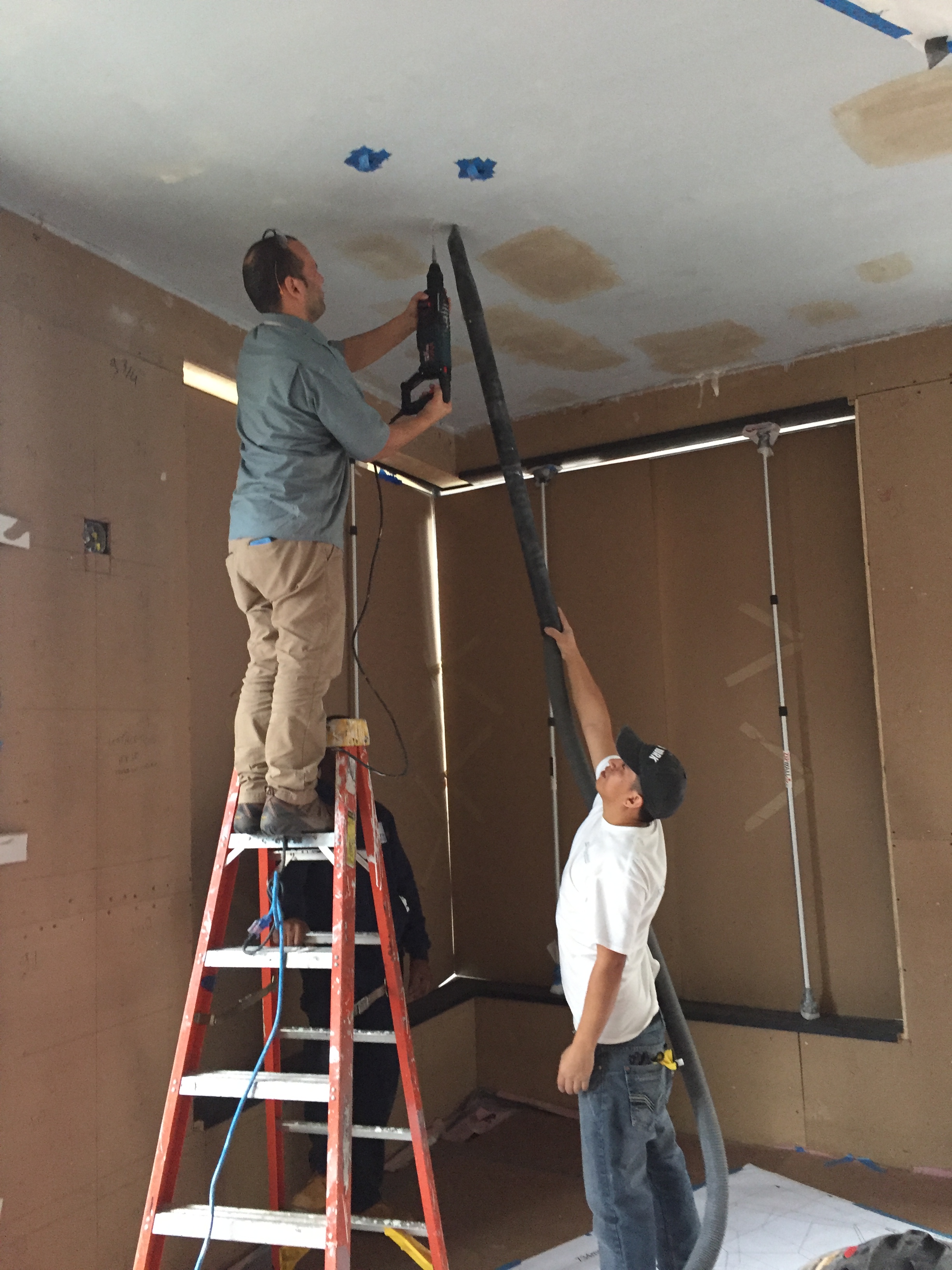
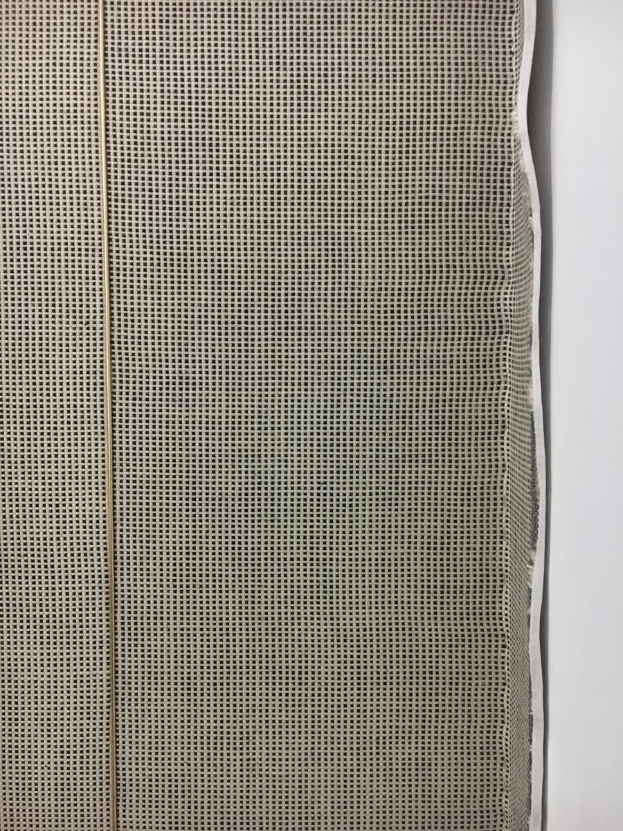
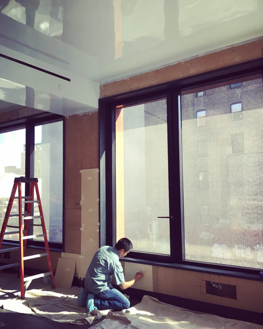
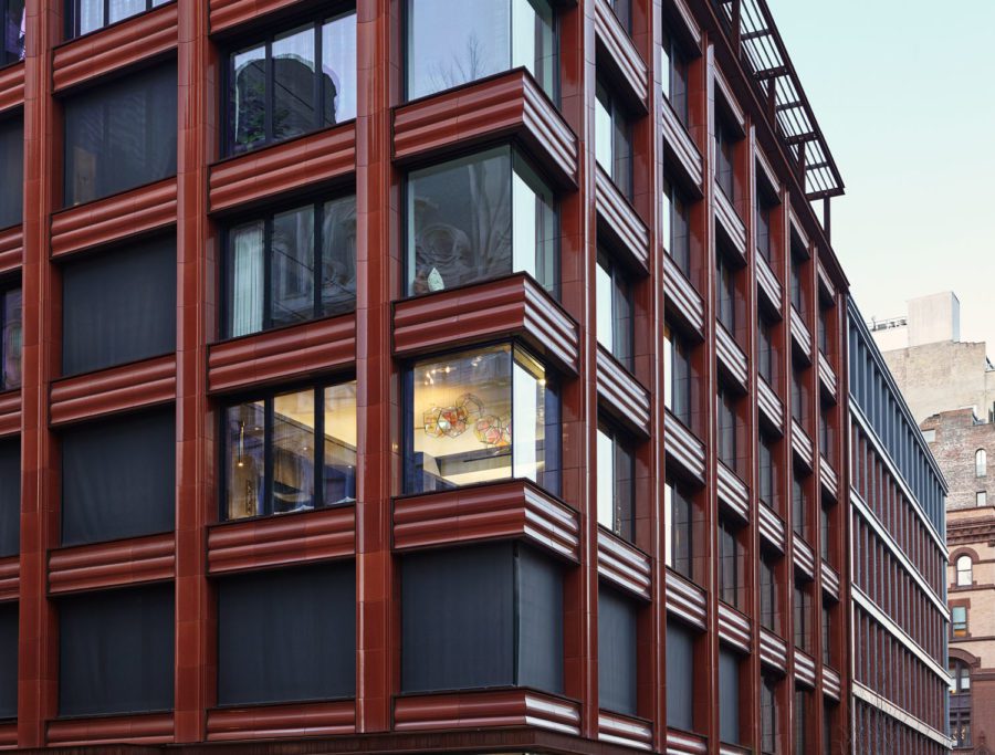
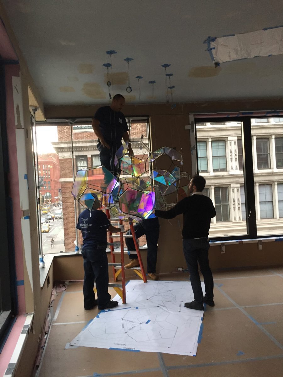
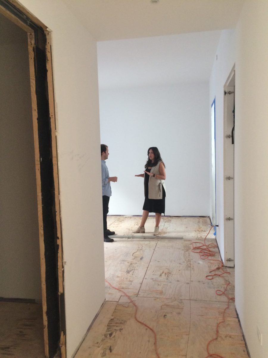
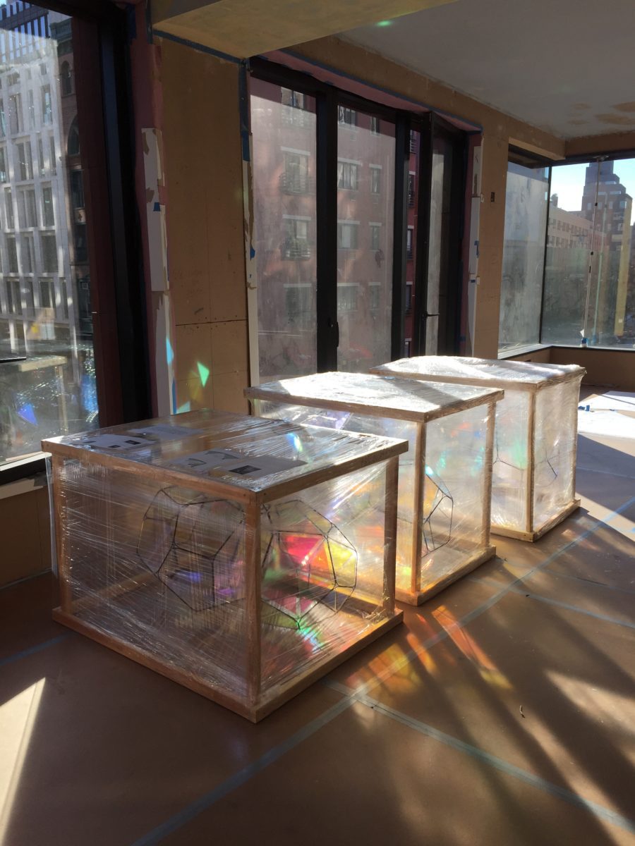
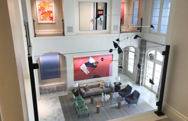
Our returning bachelor client moved into Annabelle Selldorf’s Bond Street loft building. The first site visit revealed incredible views though also a long football field of white drywall, an uninspired kitchen, and spaces that felt unfinished. When you’re dealing with a client who is not afraid of bold choices, the design instincts kick in extra clear. How do we treat the envelope and where are the focal points? Wood floors are replaced in a wider board gray tone and all window frames, base boards, and doors are replaced with a rich ebonized oak. These features ground the space, while leather paneled walls and upholstery bring warmth. Unglamorous moves like adding lighting and relocating outlets and light switches are wins. We kept existing kitchen appliances to maintain the budget but amped up the design with a new backsplash and brass-trimmed upper cabinets. Perhaps the most prominent experiential move was creating the glossy water-like ceiling, so glossy it reflects the cityscape beyond. From construction to decorating to art- the interior reflects a strong point of view and most importantly, reflects our client.
Loft Design: Before & After
