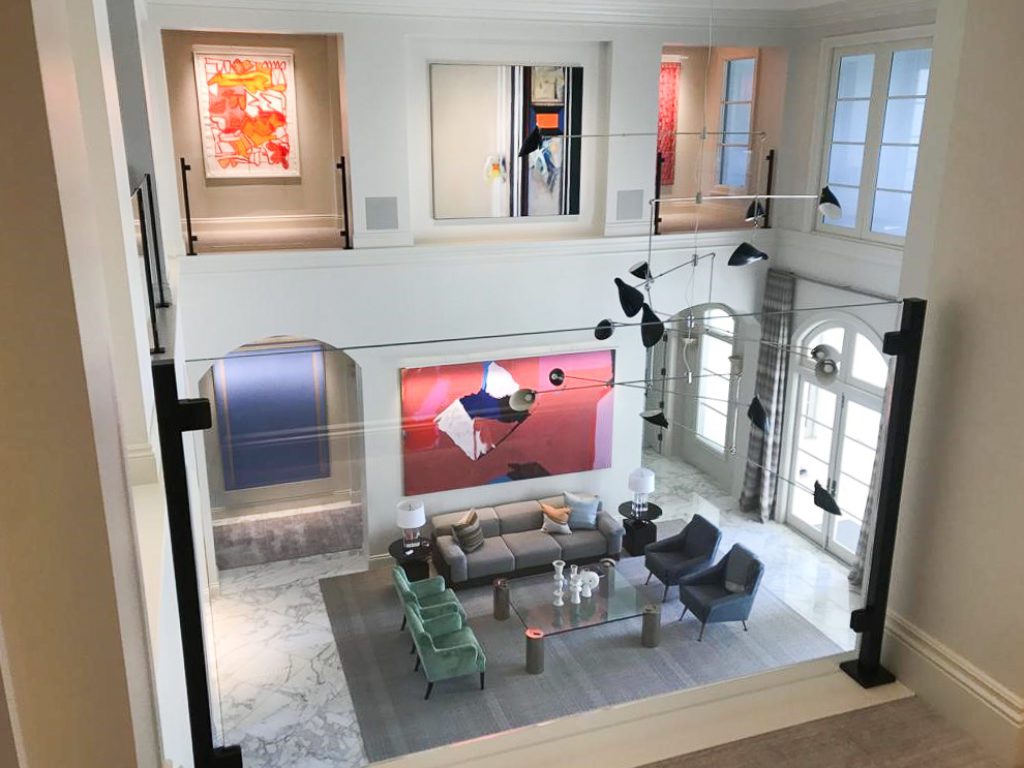
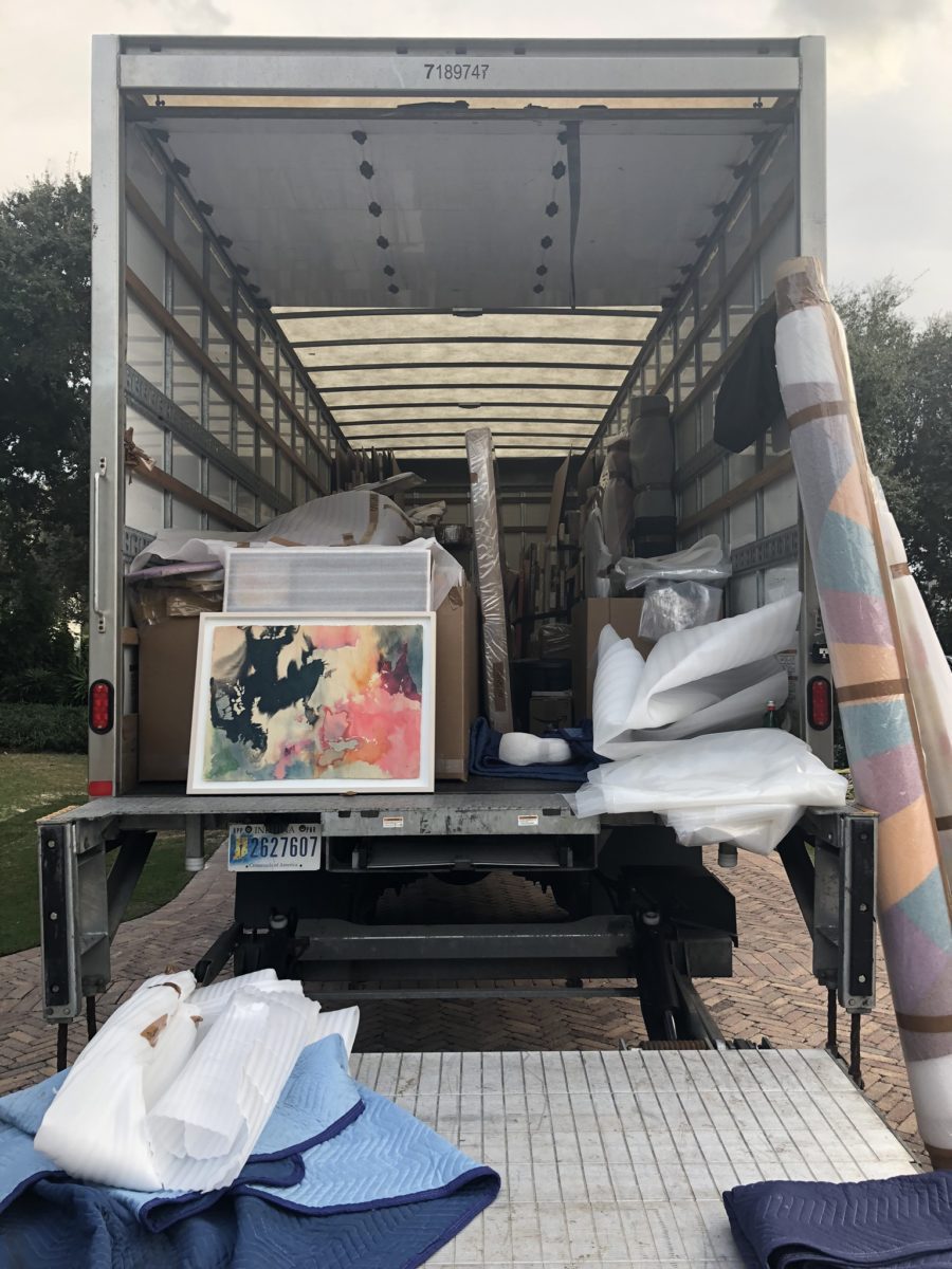
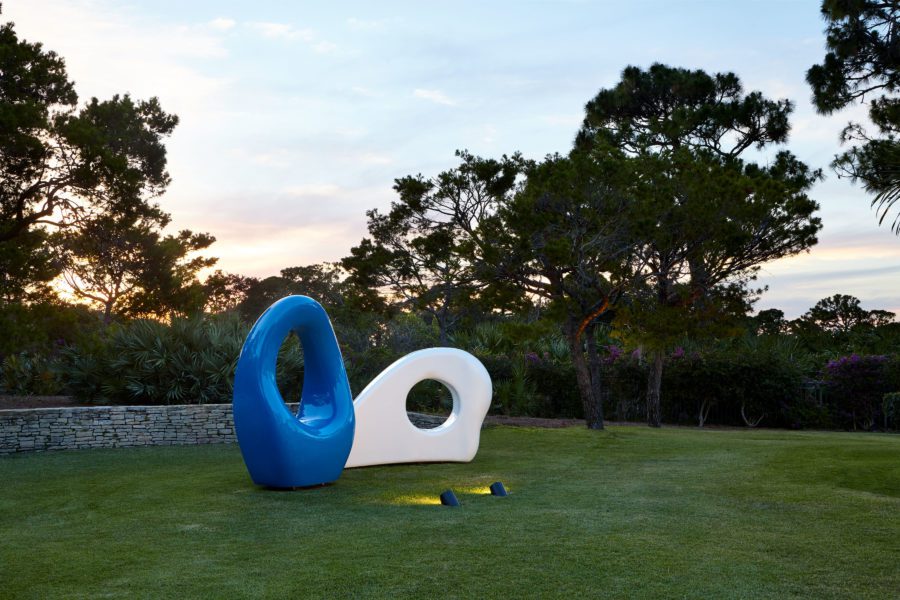
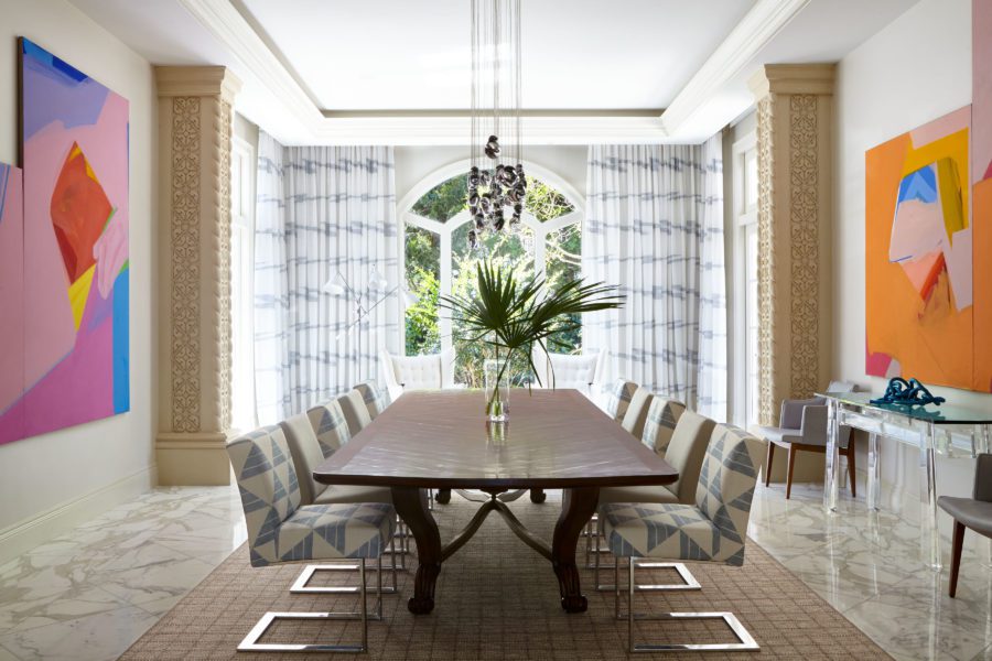
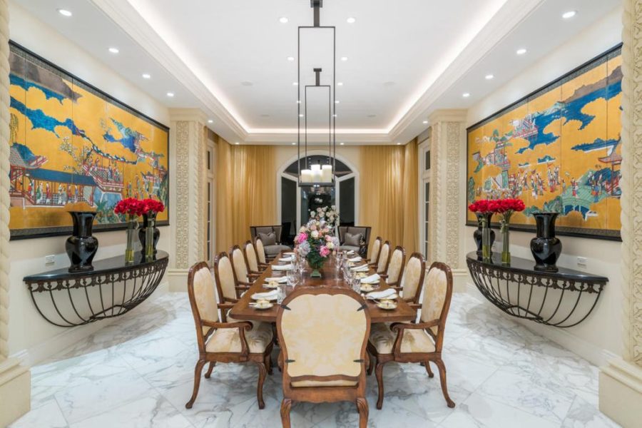
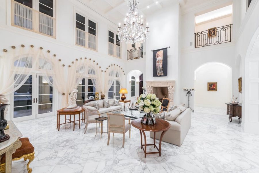
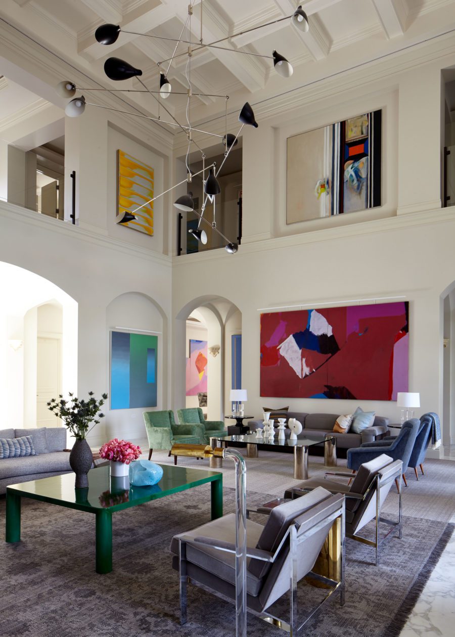
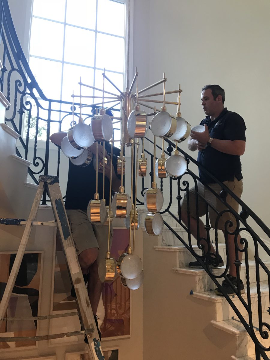
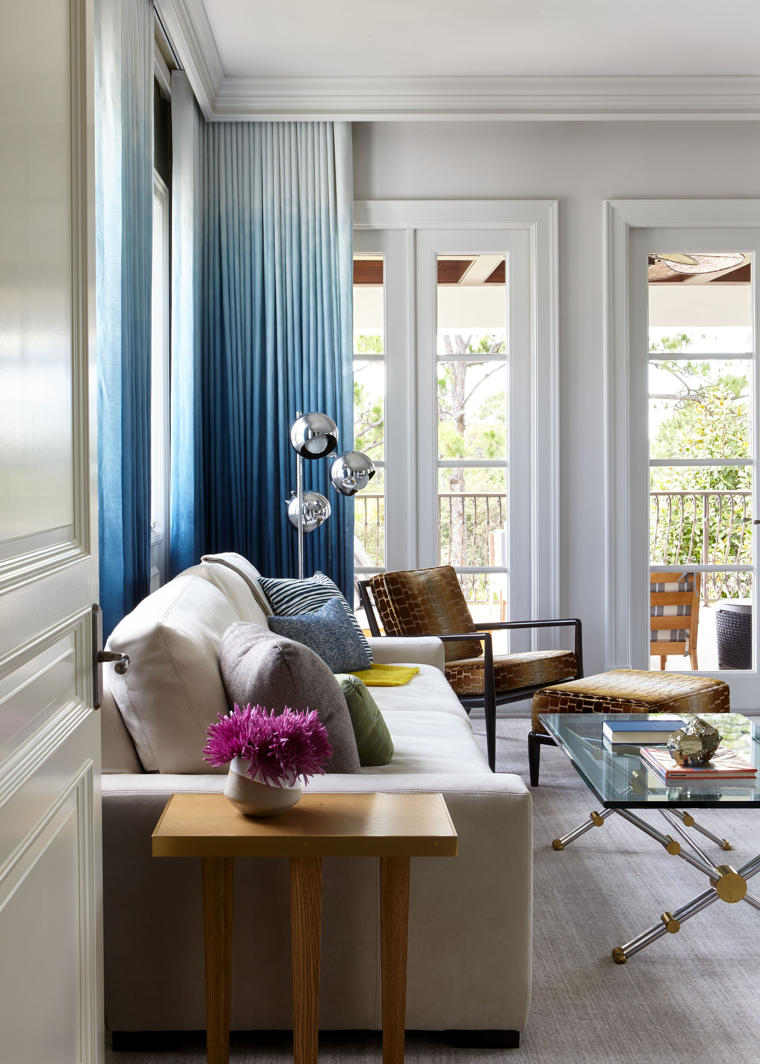
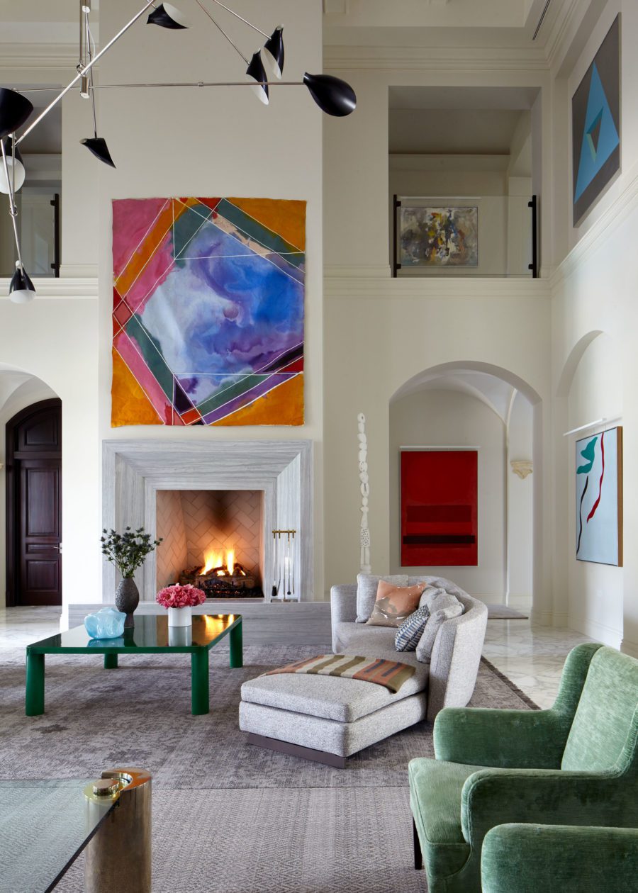
We moved our client from New York to Florida and created a personalized home through a surgical renovation and furnishings plan that combined new selections with an inventory of vintage pieces. Over a two-year period we curated a massive art collection of both interior and exterior works. The plot line here? Living comfortably with art and beauty, both inside and outside.
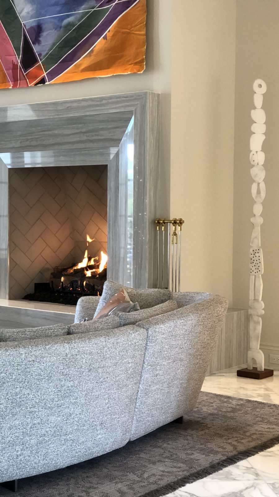
With renovations, there is always a dance with a client about what stays and what goes. Here, the pitch was to edit elements that distracted from enjoying the art. Cherubs at the mantle – gone. Frilly wrought iron accents – gone. The spaces were modernized with cleaner lines and opened up to feature the art.
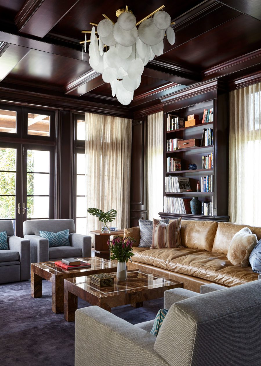
In our standard fare we find the right balance to make everyone happy – us for design and client for comfort and livability. Recliners in the dark wood-lined Media Room? Sure, but custom chairs to our design specifications with a contemporary light fixture. Many of our clients ask for a neutral palette with pops of color, usually in the form of throw pillows. The Jupiter home illustrates how we work our magic to gain approval on concepts employing color in more thoughtful ways. Still clean. Still modern.
