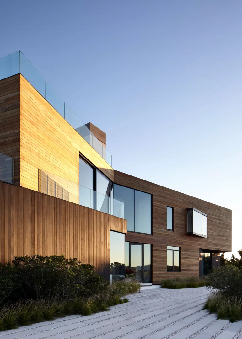
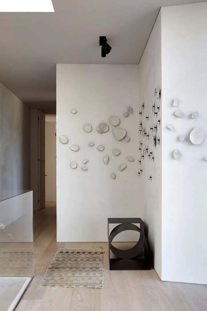
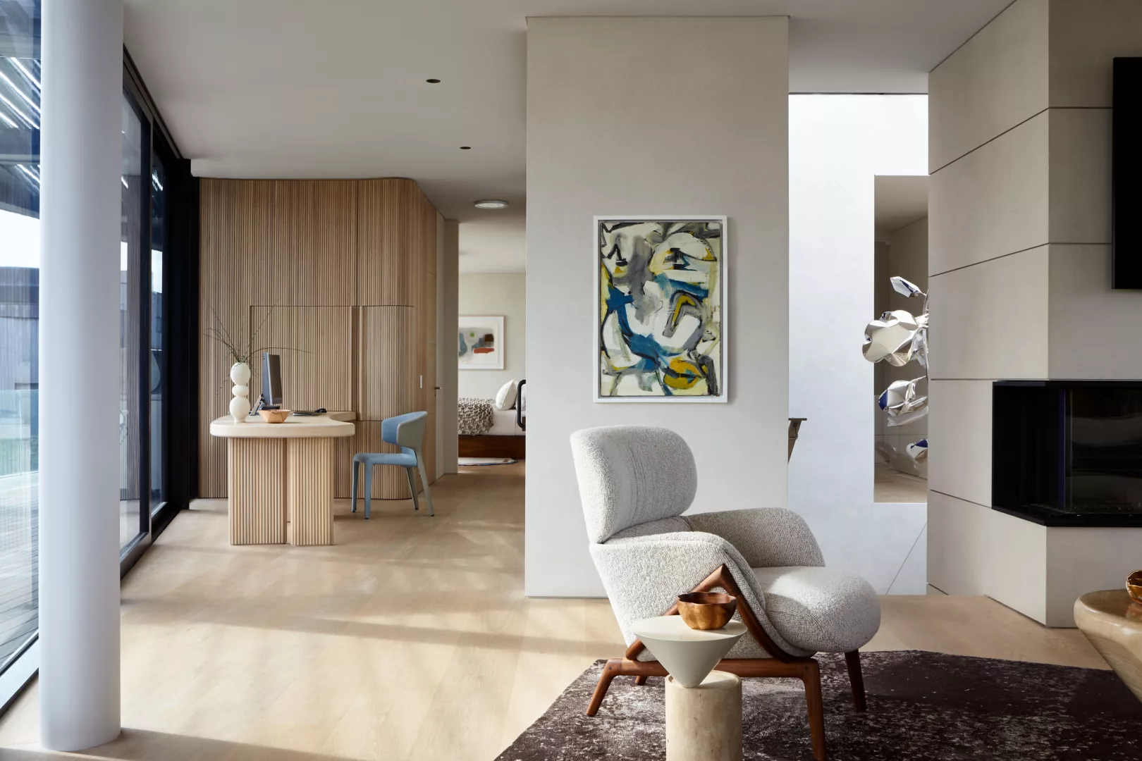
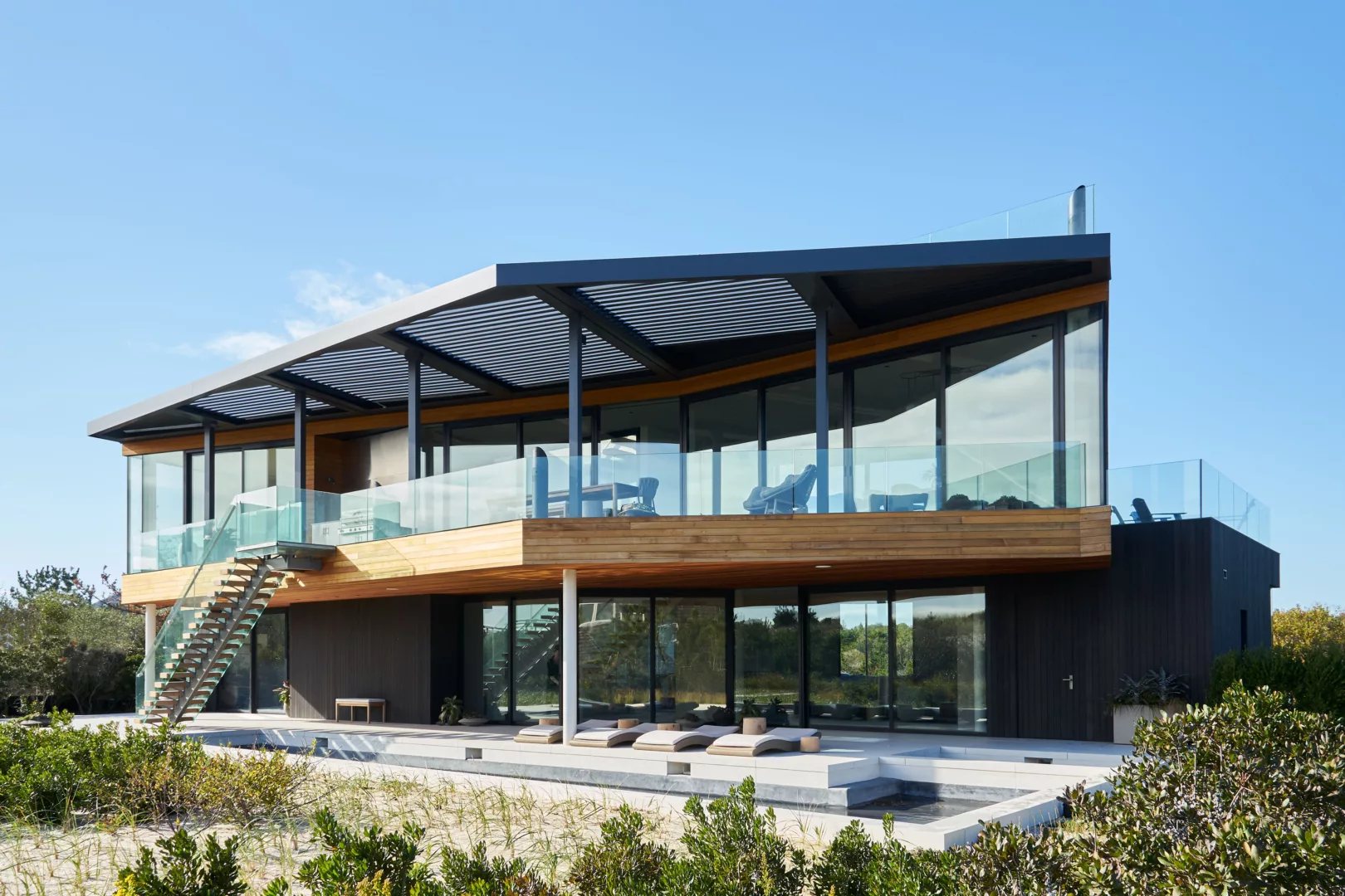
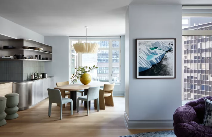
A modern, minimalist counterpoint to the classic Hamptons beach house, our Amagansett Dunes project exemplifies what we call ‘studied simplicity.’
When the clients set out to create a coastal family retreat, they enlisted Barnes Coy Architects to design a strong architectural statement. The interior, however, was to be decidedly soft, warm, and livable – and to remain neutral while avoiding the ‘white beach house’ aesthetic. In response, we created a complex neutral palette, punctuated by shades of blue at strategic and sometimes unexpected locations, while also carefully calibrating spatial flow and custom elements. Or in other words, this easy-going, modern oasis is actually the result of many careful studies.
To achieve serene, coastal refinement, we honed in on a few key elements: balance, form, and strategic color. Each required careful consideration in response to the site, architecture, and the client. The result? Simply magic.
1. Balancing Act
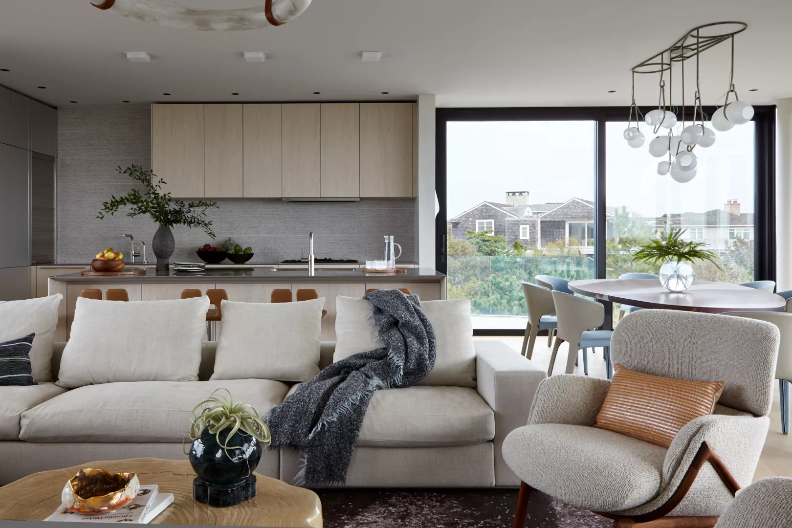
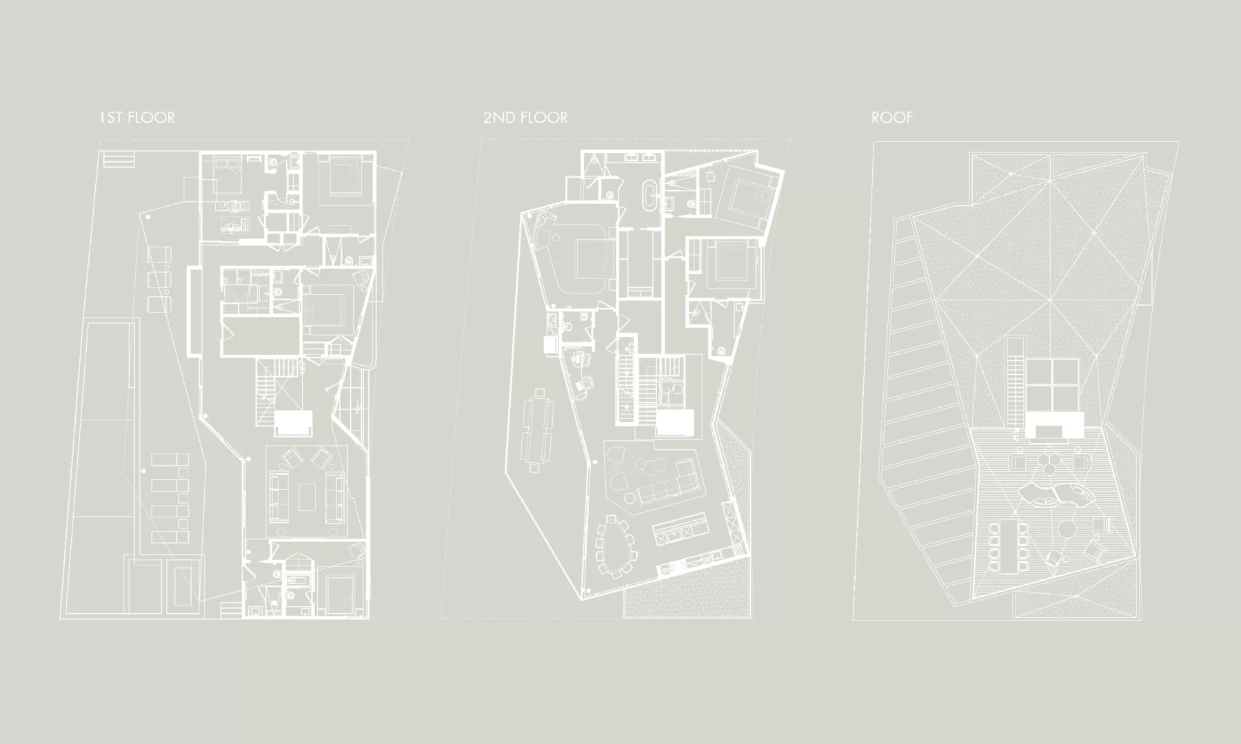
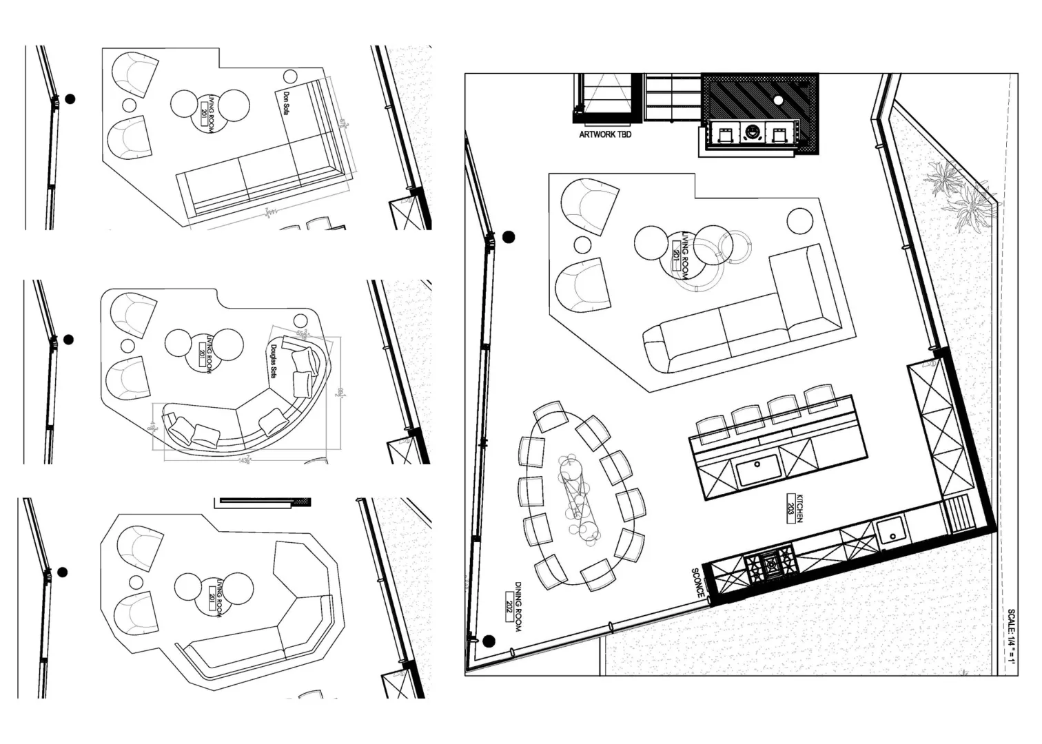
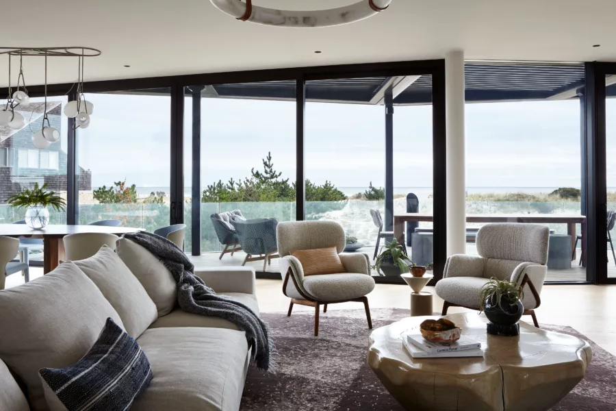
Spatial consideration was especially crucial here. Called The Bow-Tie House, the floor plan is pinched in the middle and flares out at either end -west to east. To ensure spatial and visual flow, we studied, and then studied more. We developed 12 layouts for just the open living space alone, three of which were presented to the client. Our final layout utilized curvilinear forms and custom elements to balance the linear space and preserve the ocean scenery. We determined focal points to be built-in furniture versus freestanding furnishings. By ‘floating’ the furniture in the layout, we were able to maintain the ample views afforded by full floor-to-ceiling windows within the compact volume.
2. Focus on Form
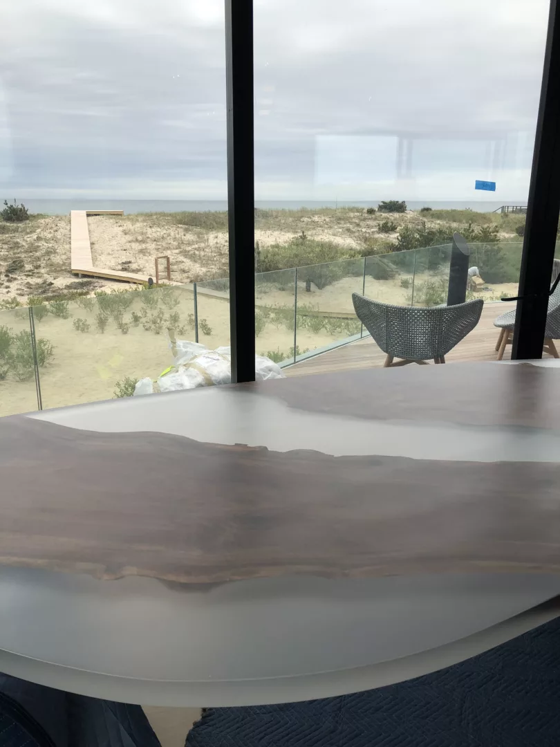
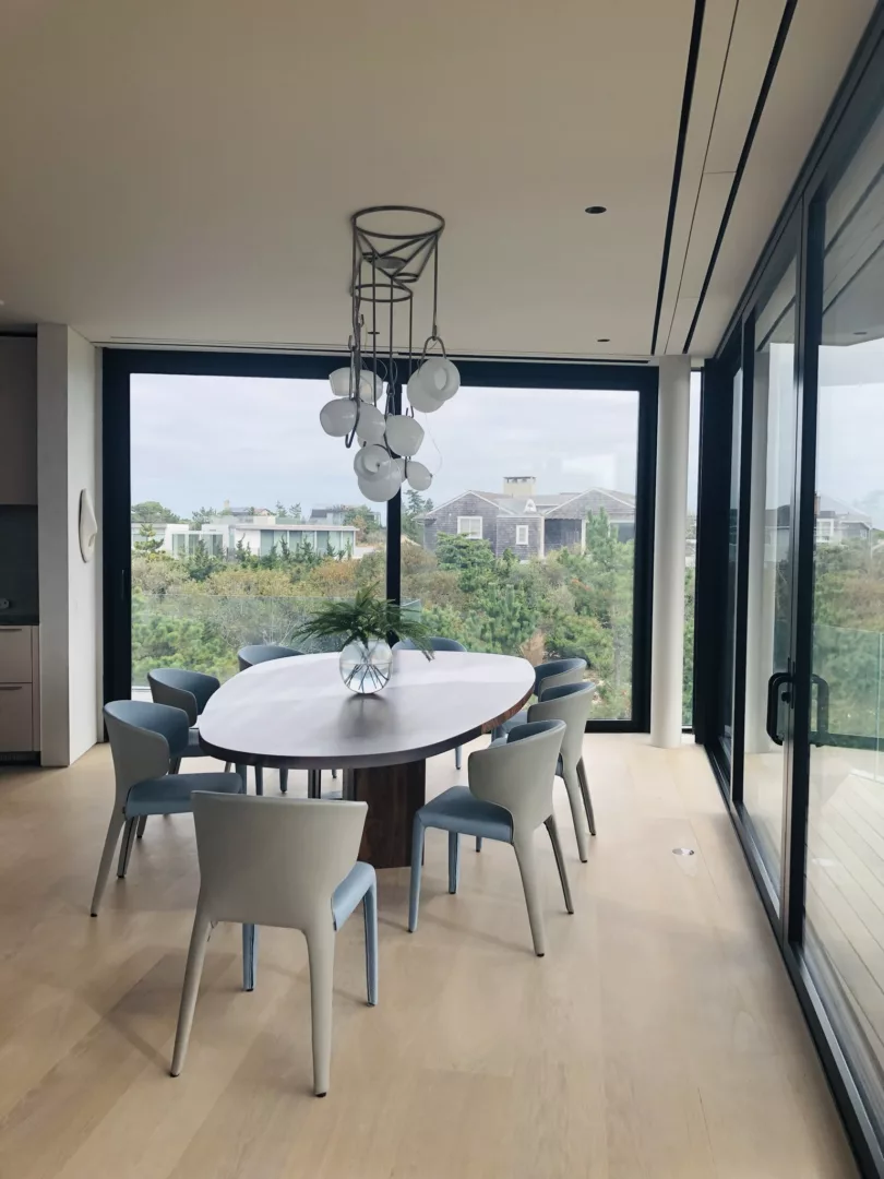
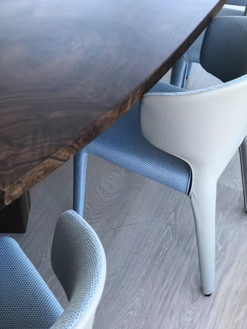
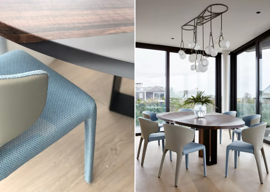
Working within the distinctive architectural envelope, individual furnishings required equal consideration as the layout. The home’s only interior dining area, situated within the open plan living and kitchen area, was a highly studied situation in itself, as it would accommodate both everyday life and occasional entertaining. We designed a custom walnut table with an irregular oval shape and resin finish that resembles the texture of surf water. The shape and scale of each element was studied in detail to ensure a comfortable fit – both within the space and seated at the table. After multiple rounds of drawings studying place, setting size, and knee space, we arrived at the final table design.
3. Color Strategy
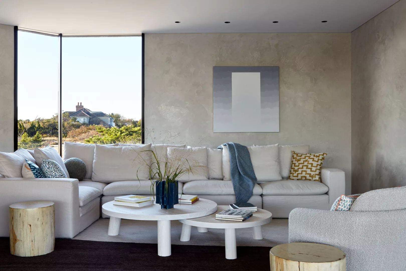
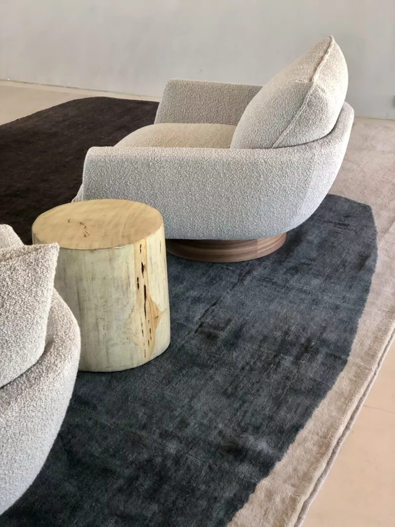
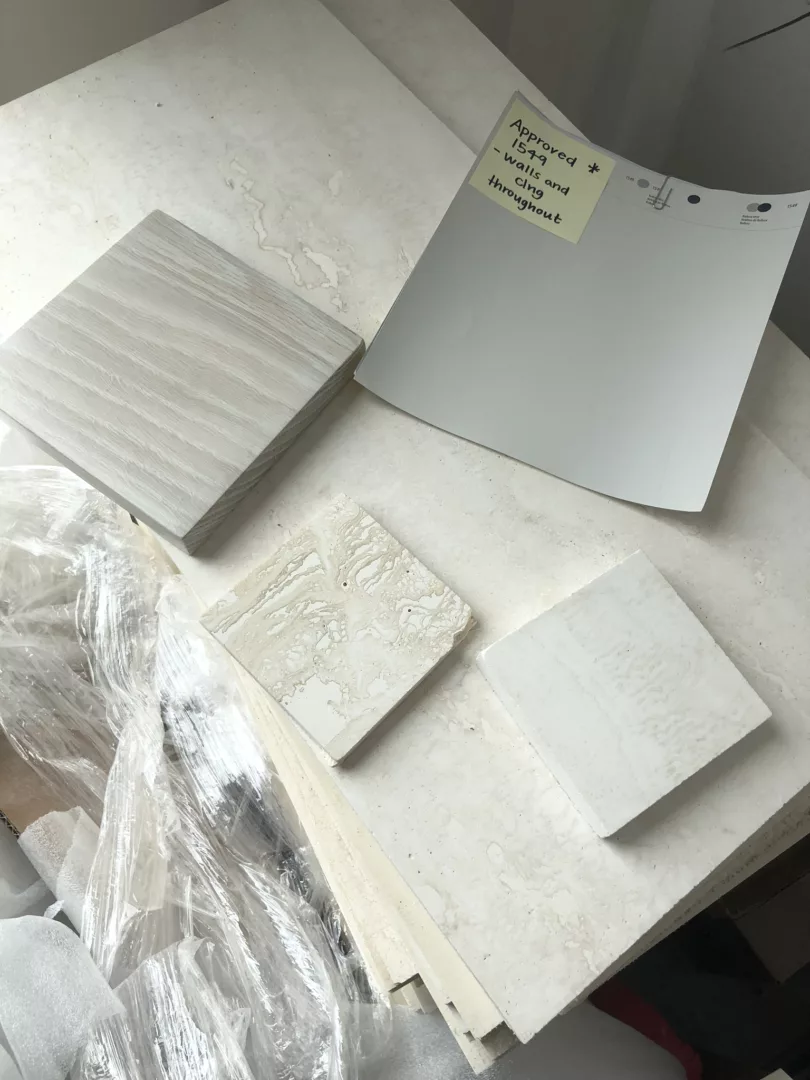
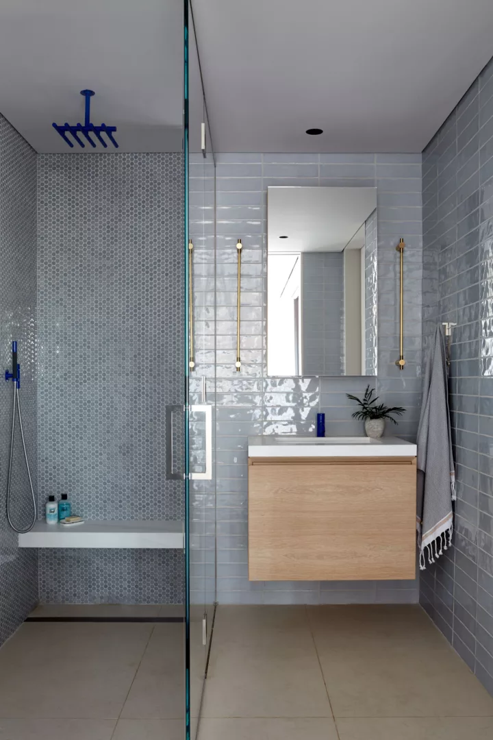
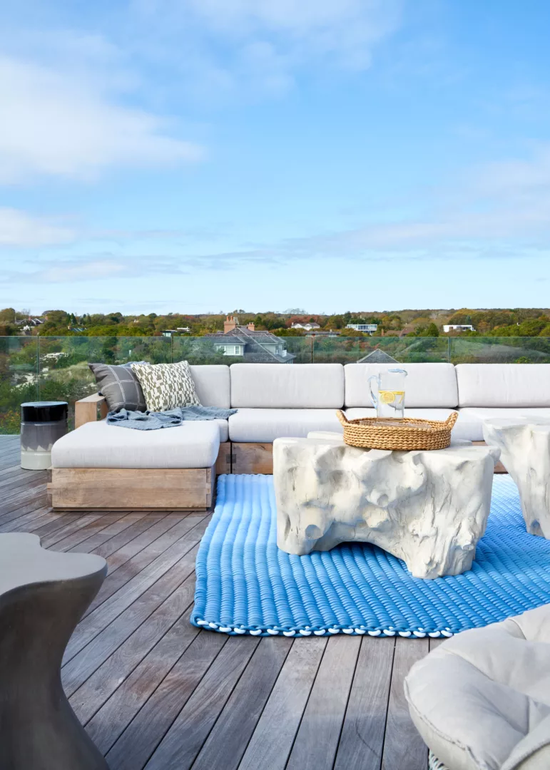
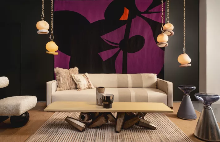
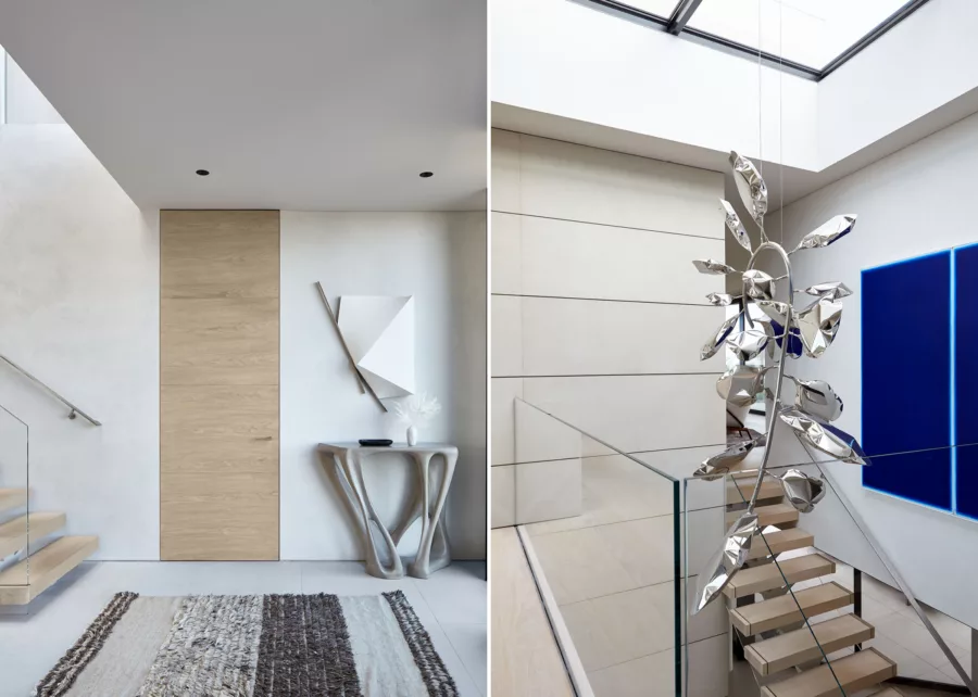
This client came with a firm desire for a neutral (but not basic!) palette. We use the same strategies with neutrals as we use with color: balance warm and cool, layer texture, and play on light. Counter-intuitive, and antithetical as it may be to the ‘Hamptons beach house’ aesthetic, we avoided using true white which had the potential to read as sharp or harsh. Instead, we cultivated a sense of quiet, drawing largely on the colors of the surrounding landscape with a variety of sand and sky tones, and used texture as a fifth element with plaster, chunky knit textiles, and organic surfaces throughout. Early on with the client, we identified a comfort level with blue, and strategically chose our moments to be bold(er)… the seat of a dining chair, fixtures in the guest bath, and a powerful work by Ted Kurahara in the stairwell.
