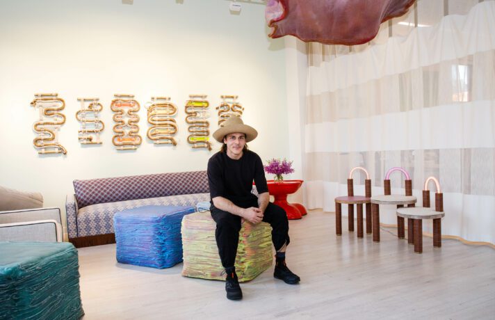
It was a privilege jumping into our Brooklyn Townhouse project – and Luxe cover story – with a repeat client-couple who had purchased a new home for their young family. We established an incredible foundation of trust working together, so they were gung-ho about some of the wilder ideas we brought to them; and the gorgeous landmarked property housed not only the growth of their mixed-media art collection, but also where their children would grow up and, from a space-use perspective, grow into.
Overall Strategy
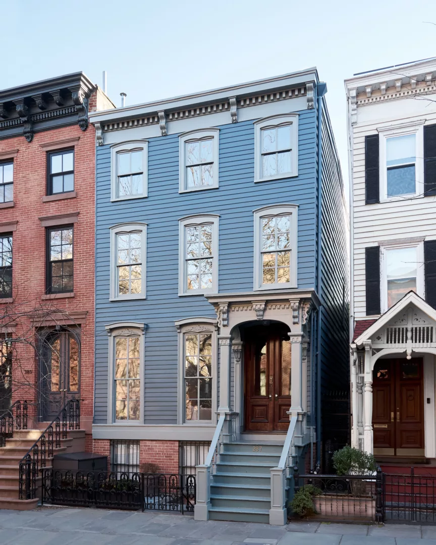
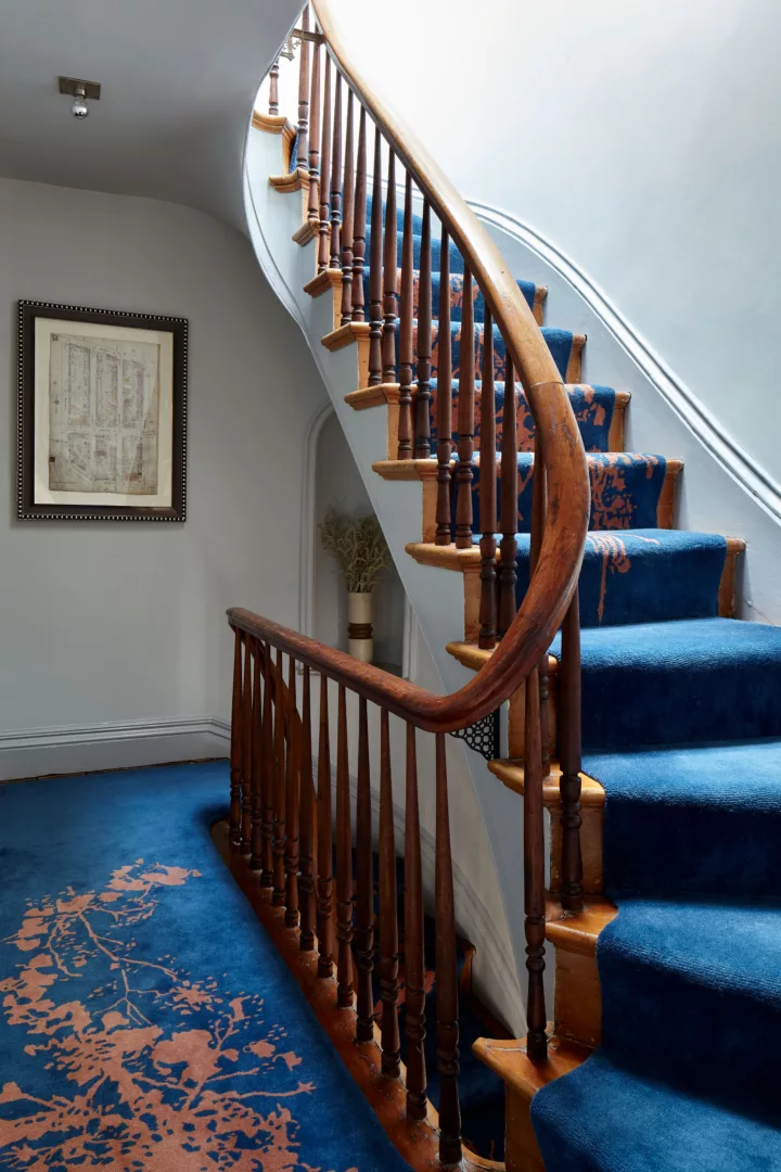
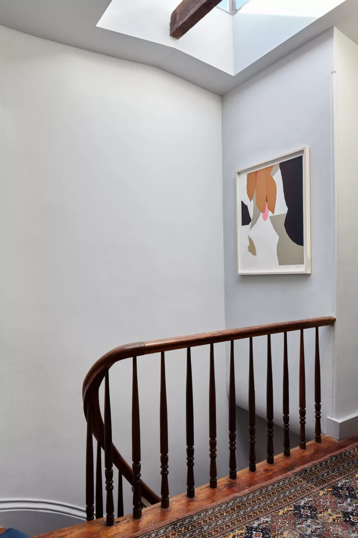
We approached the project with a comprehensive renovation of its historic 1853 bones. We made modernizations through structure, amenities, and furnishings, while preserving the gorgeous classic touches like mouldings and original wood window framings.
Where these choices felt like a given, there were other tensions involved in the decision making. One of the husbands is self-described “granny chic,” while the other is more “Brooklyn nautical.” This is the designer’s duty to reconcile, and a fun challenge to visualize in cohesion — through construction vision, design vision, and of course, expressions in art.
Or, in the client’s words: “Elena knows what each of our aesthetics are, finds the overlap between them, and pushes us to be bolder.”
Living Room
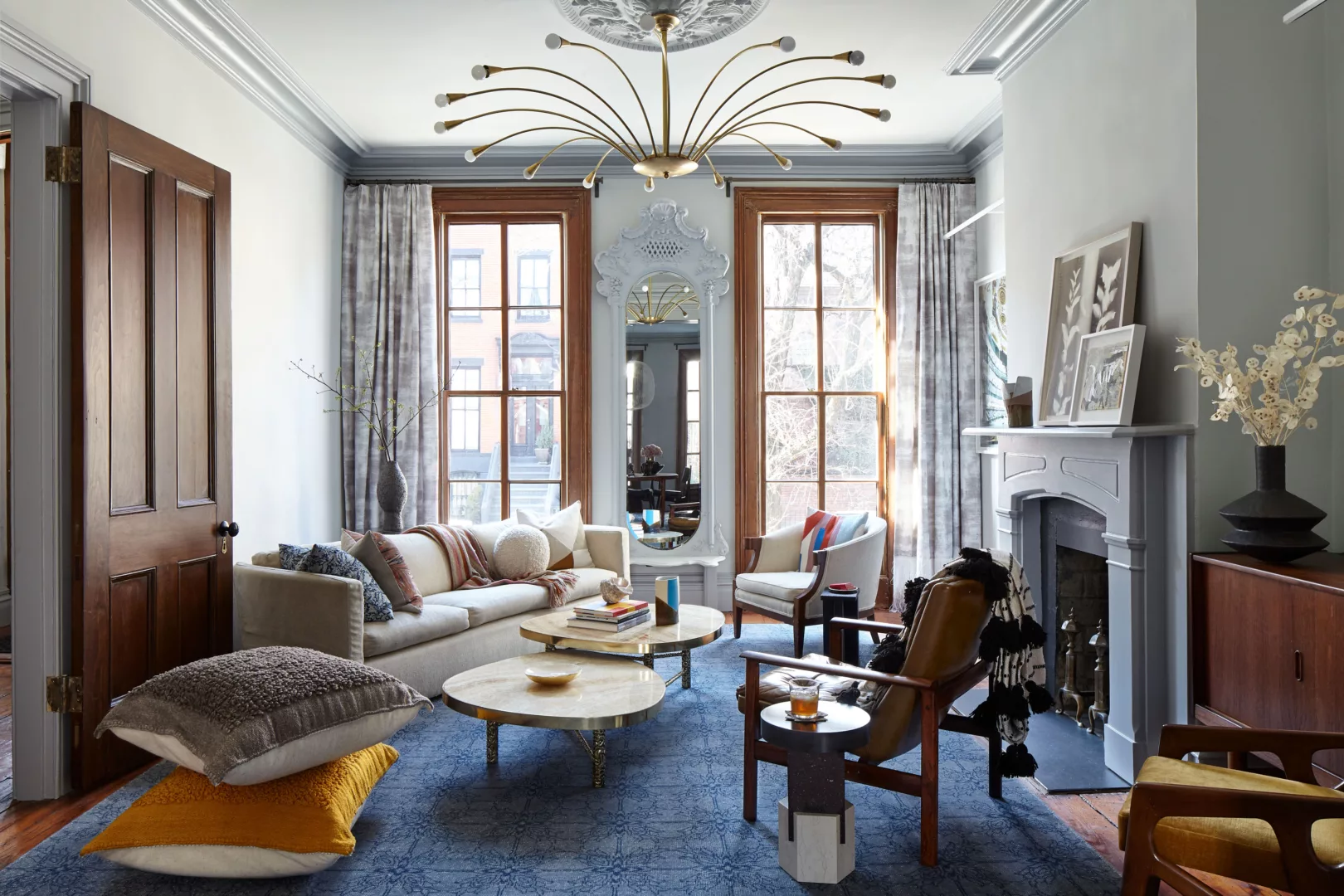
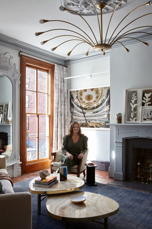
Years back, we acquired a large-format photograph by Andrew Moore for the clients’ collection. Having grown tremendously in value since then, it was an absolute pleasure to display it in their new home. We placed it prominently beside the living room fireplace, and used this work as starting point for the way we curated additional art works into their collection, mixing mediums and scales from there.
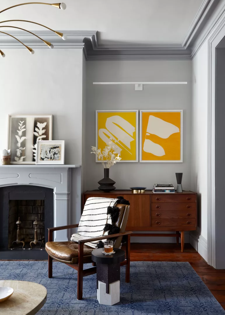
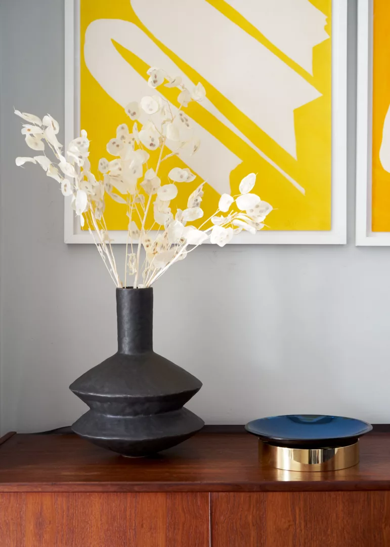
On the fireplace mantle is a monochromatic foliage print by Sydney Butchkes, paired with a smaller artwork – a newer addition to the family’s collection – by American painter Jorge Fick. In contrast, two works by multidisciplinary artist Jack Youngerman provide a vibrant, dichotomized study in color from the edge of the space. His abstract paintings of simplified, organic forms offer an exploration of figure-and-ground relationship. We framed the Youngerman pieces in different yet complementary styles, exemplifying our conscientious intention to find common ground between the couple’s varied tastes.

Dining Room
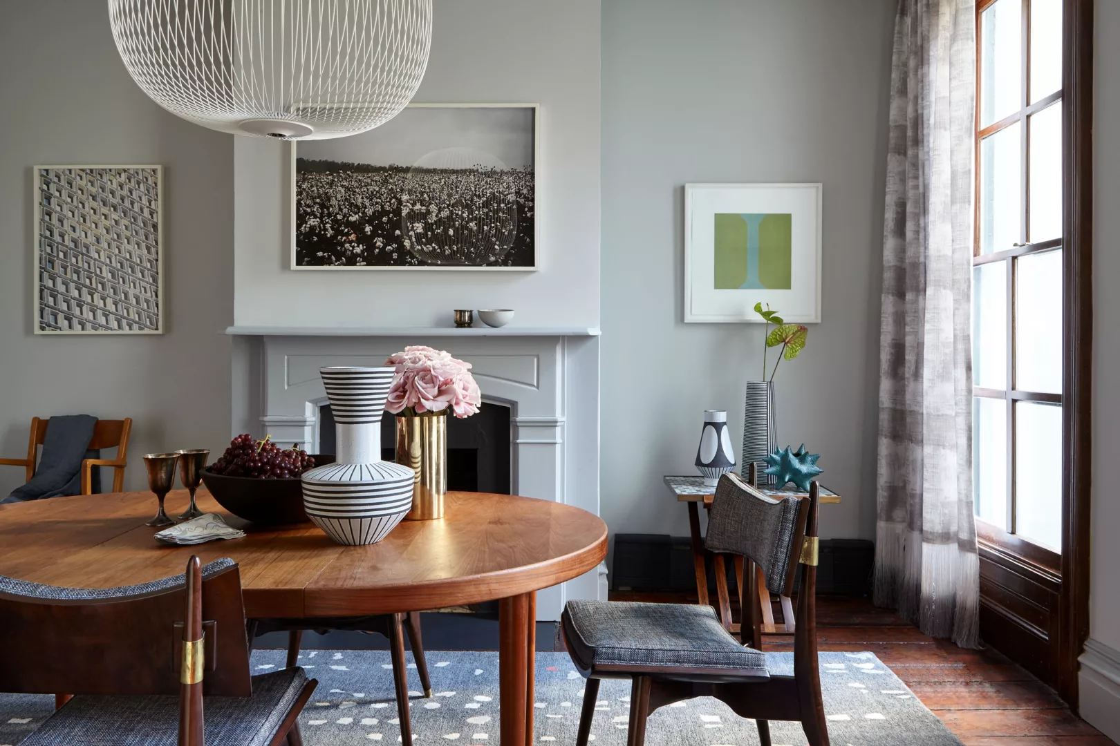
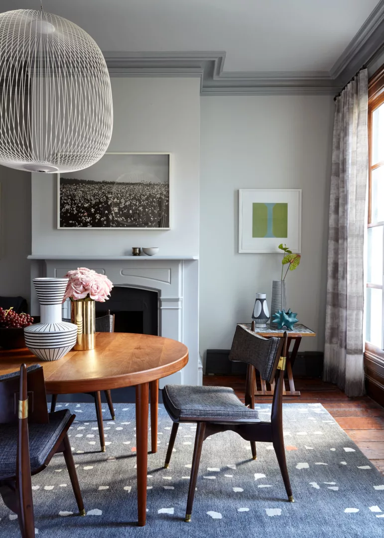
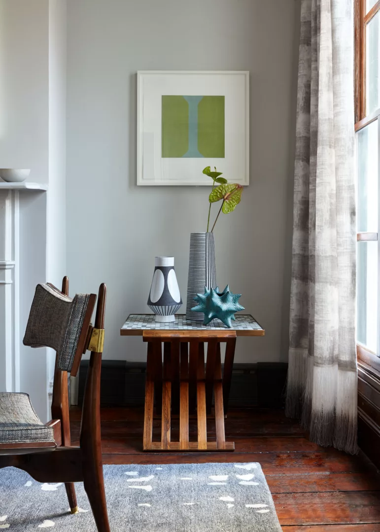
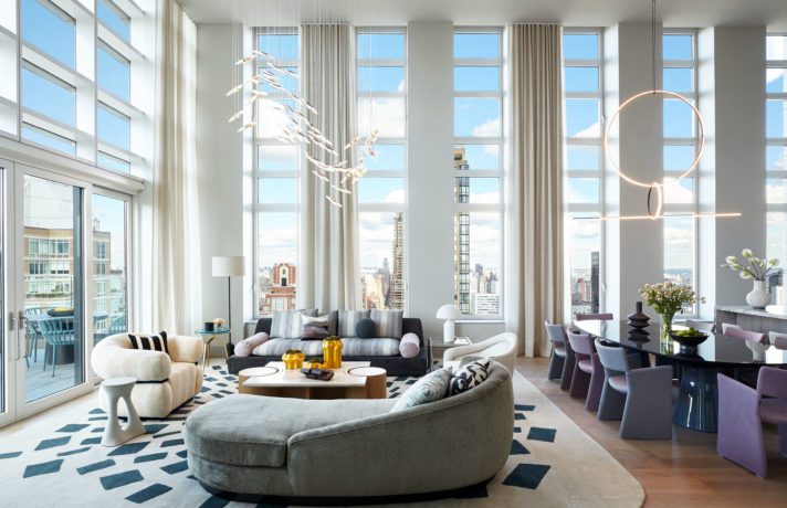
Our approach continued into the adjacent dining room, with a mixed mediums and styles in the artwork selection, as well as a balanced consideration of art and design. Throughout the living and dining spaces we utilized a cool blue and gray palette to counter the warmth of original wood floors and wood framing. The artwork, a diverse yet wholly contemporary selection, was placed alongside the original fireplaces, balancing their traditional detailing.
In this space, we placed a familiar work by Isabel Bigelow which, along with the Andrew Moore, came from the clients’ previous home and were the first big investments we helped make in their collection. The Bigelow monotype, “grey eye,” features a simplistic natural form with vibrant color and subtle texture, thanks to thin veils of color applied in delicate layers. As a counterpoint, we selected “Cotton Field,” a large black-and-white print by photographer Scott Pasfield, which echoes the natural subject matter with an entirely different perspective and aesthetic.
Gentleman’s Lounge
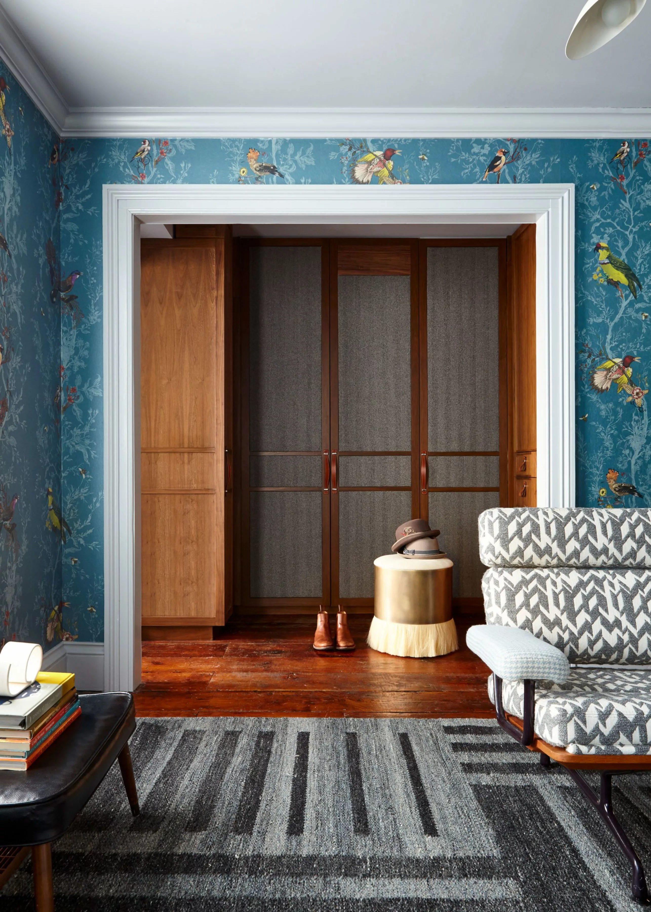
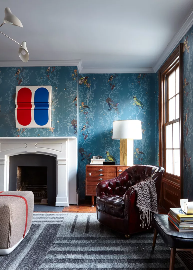
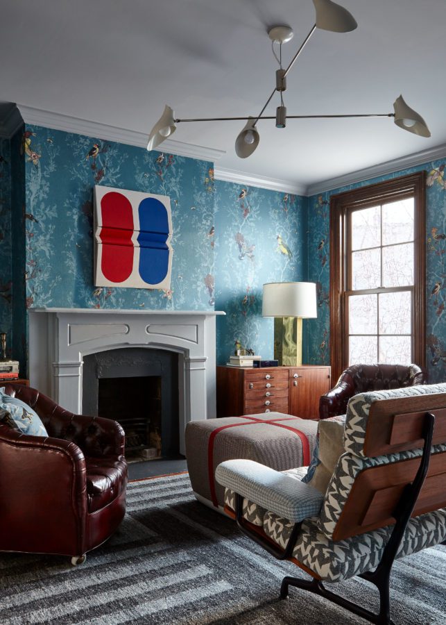
This was one of the most impactful spaces for the study in contrasts between the clients’ distinct aesthetic preferences. We brought in a balance of masculine and feminine elements with an ornate floral print wallpaper, bespoke deadstock menswear textile upholstery, plus a mix of leather and flannel with bright nickel and gold metals.
Because of the room’s function – a space for grown-up leisure and respite – we knew this was a crucial moment for art impact. So, we went bold: making a strong statement against the vibrant wallpaper, we sourced a graphic, multi-dimensional shaped canvas by Louisiana-born Robert Moreland to hang above the mantle. The layering of artwork and interior elements is one of our favorite ways to bring impact to space or reframe a work of art – and underlines the importance of not only curation, but placement.
The very floors and walls that we are furnishing in our clients’ homes are the backdrops for actual life, and what excites us is that experience. From the early-collection acquisitions to fresher additions, the way an art collection reflects an individual or family’s journey is one of the most exciting aspects of our holistic approach. Intuiting evolutions, with just as keen an eye on the client’s proclivities as we have on the art market itself, is what drives our Art Advisory, and makes up the heart of our Client Journey.
