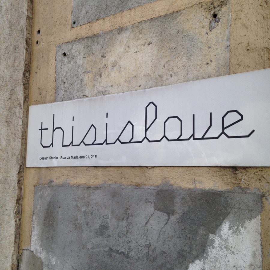
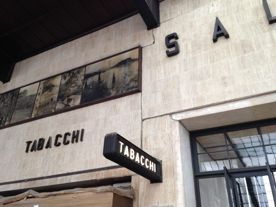
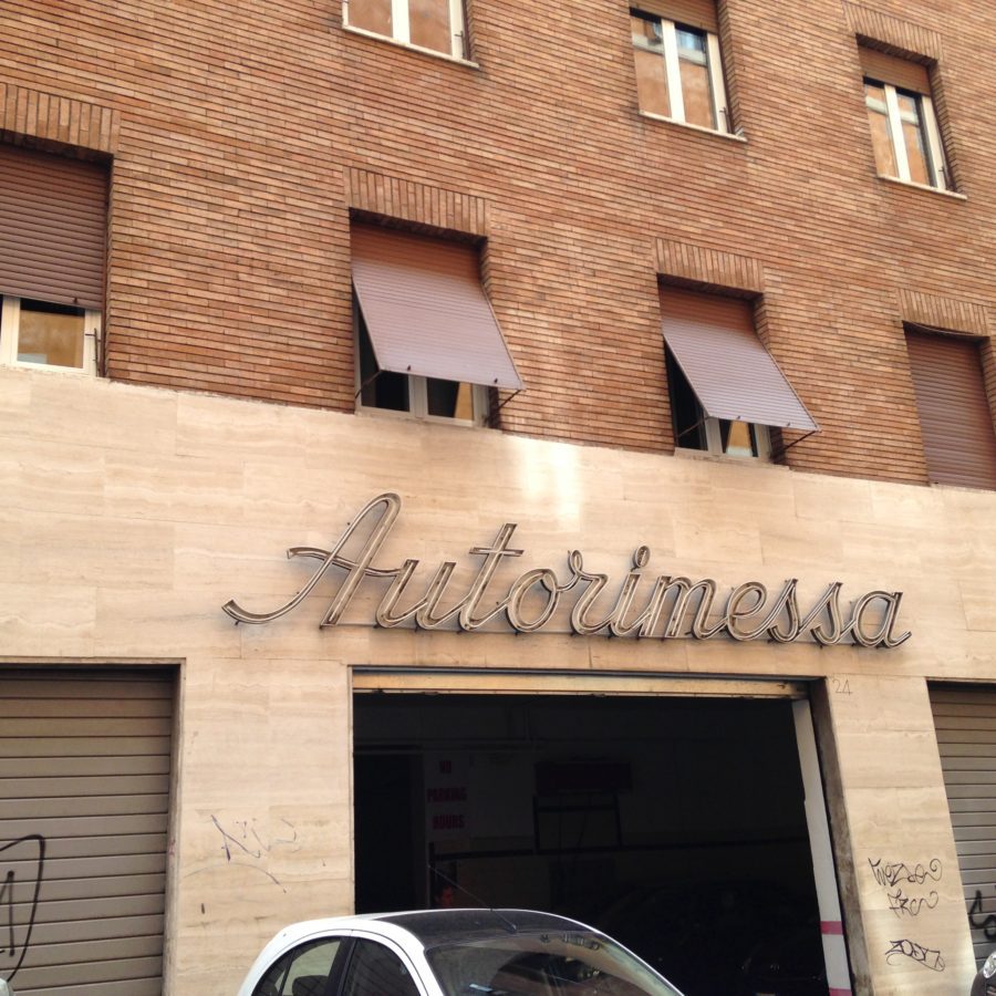
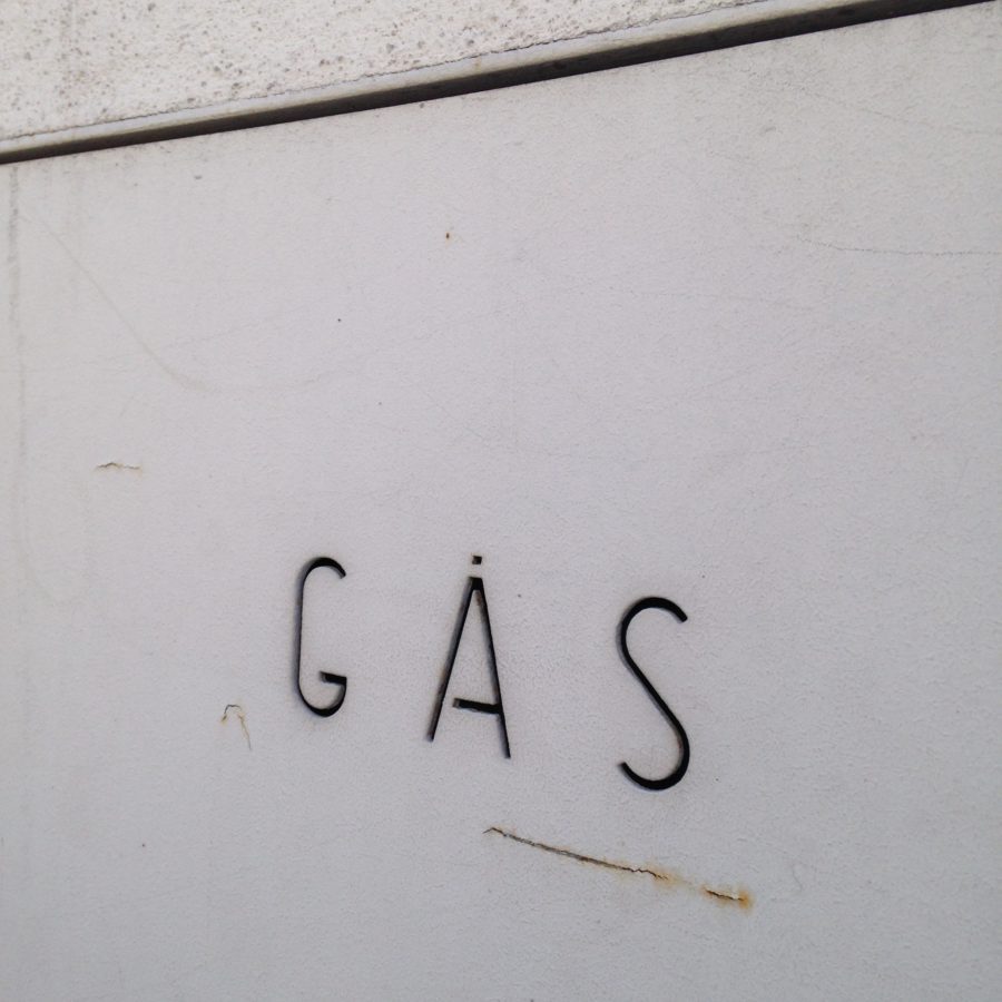
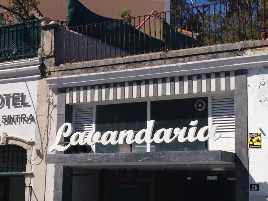
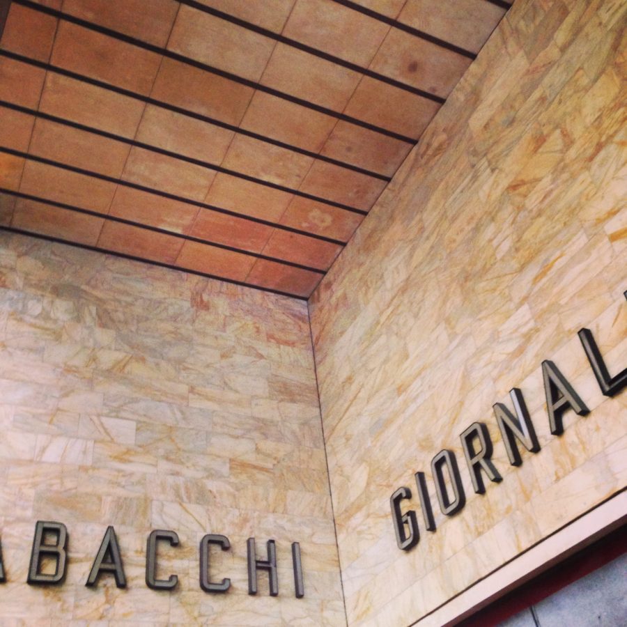
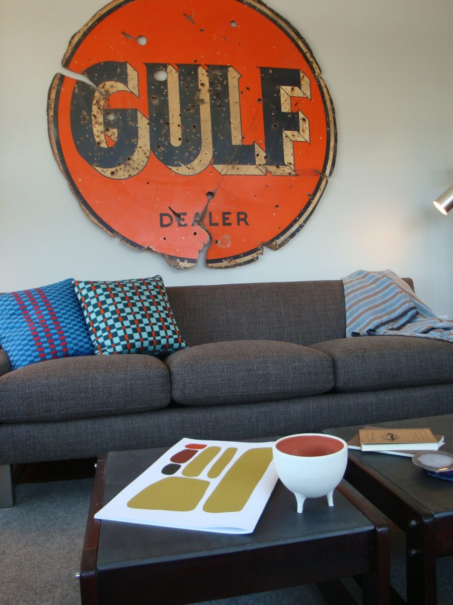
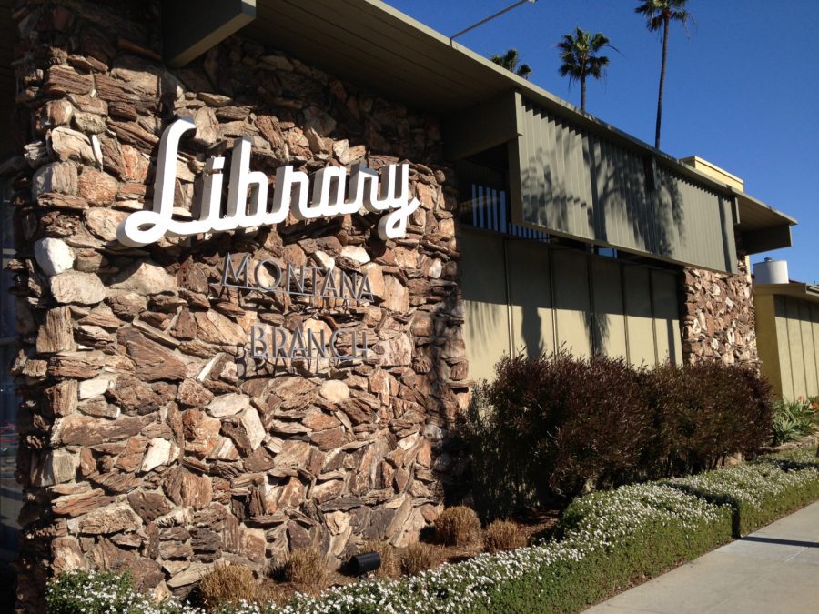
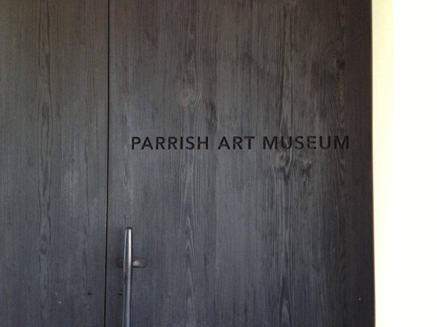
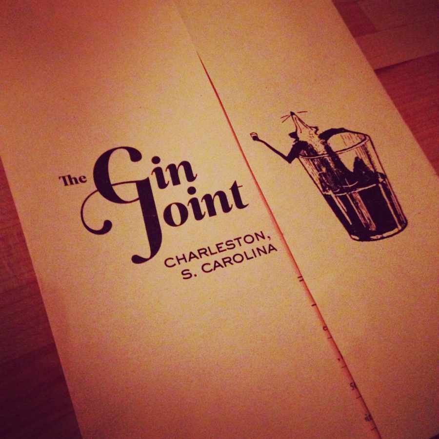
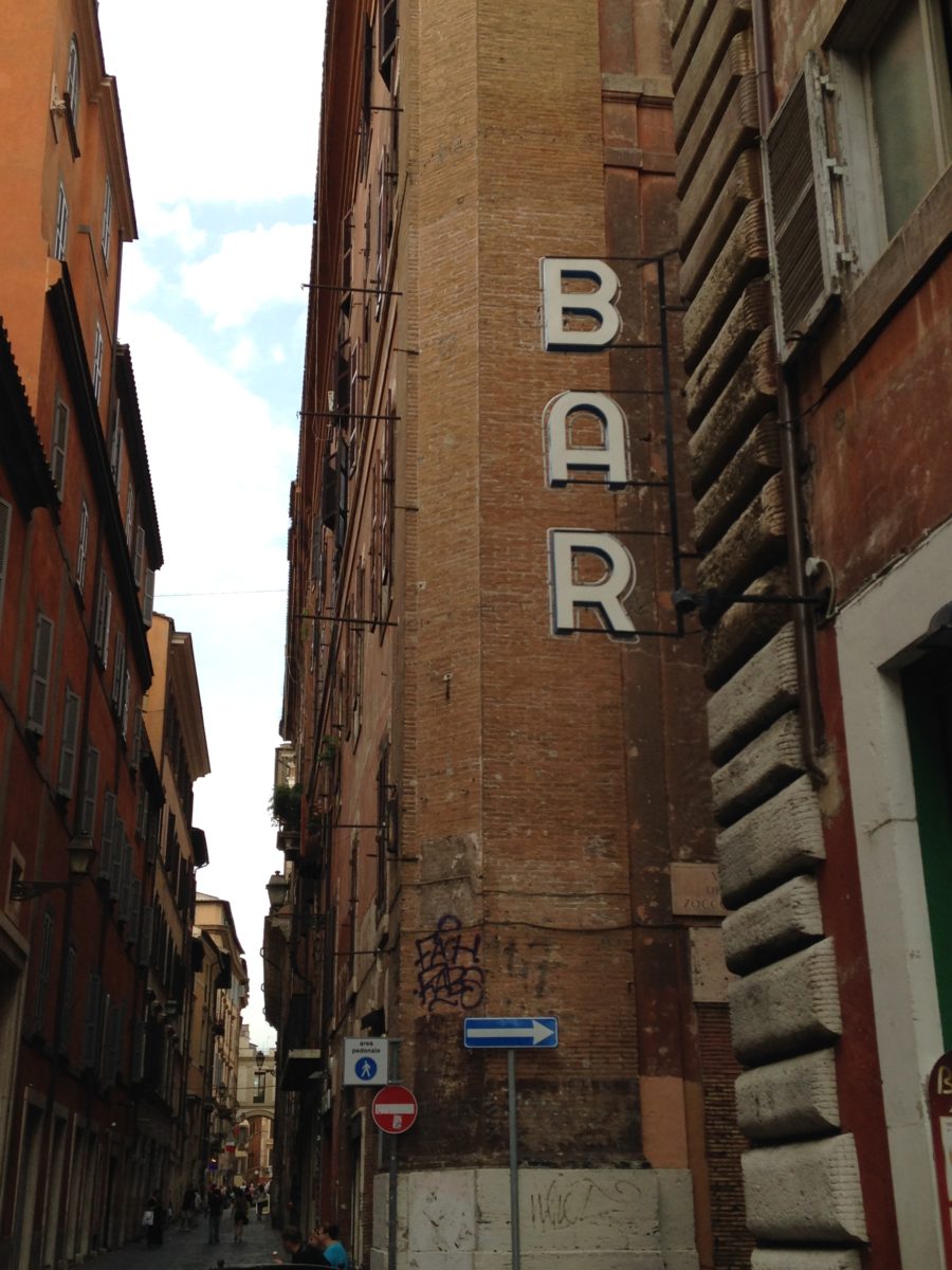
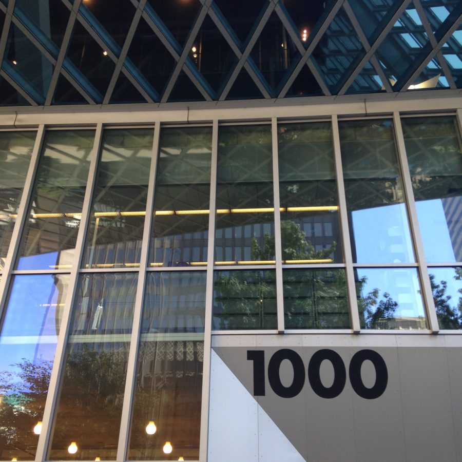
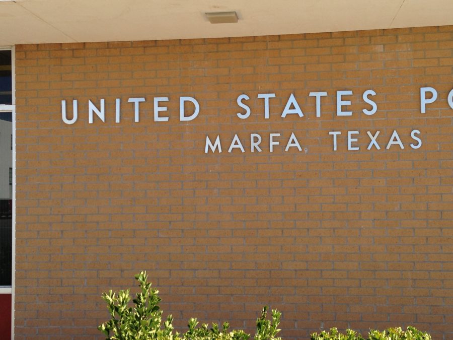
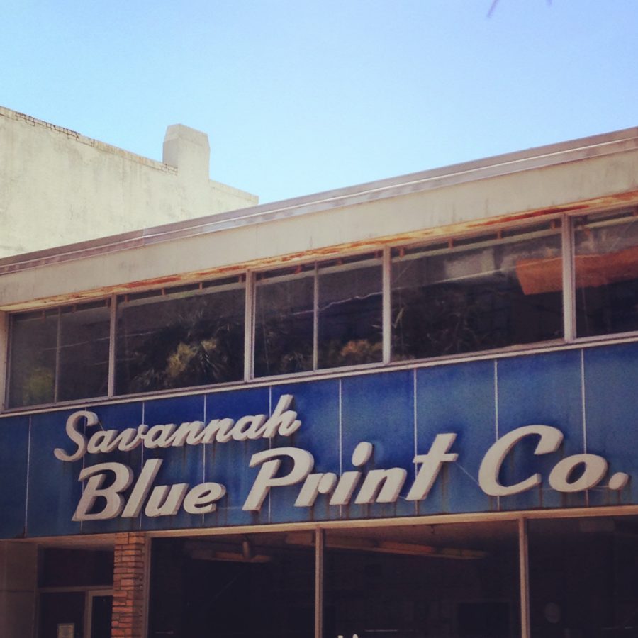
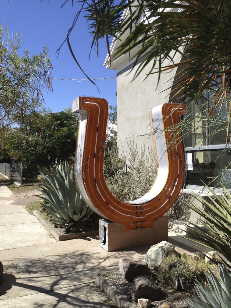
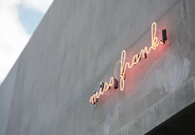
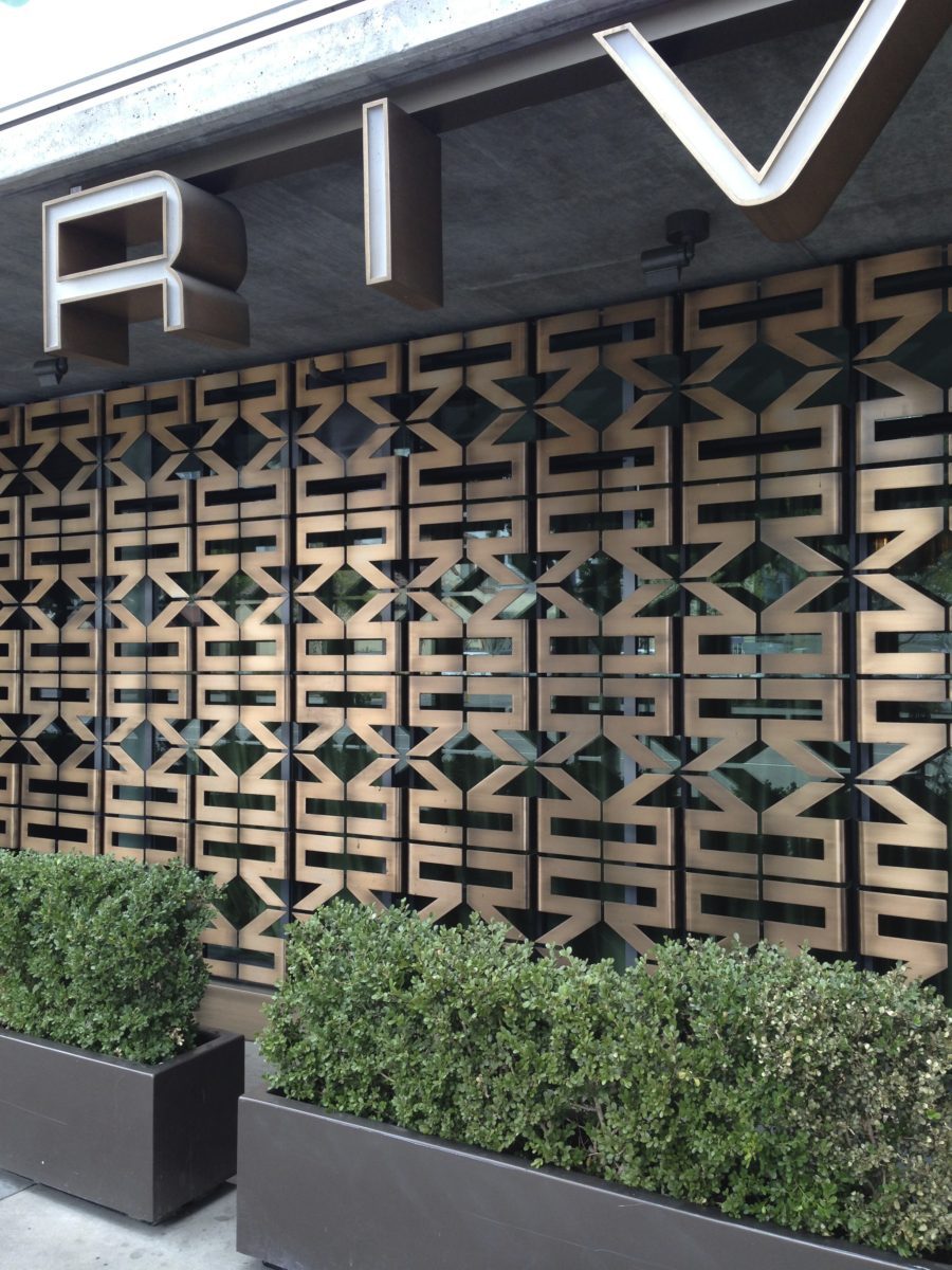
There is an art to combining just the right typography with the right space. A well suited font can stake a powerful and nuanced claim in the definition of a spatial aesthetic. Since Robert Venturi and Denise Scott Brown helped articulate our world of ducks and decorated sheds, architectural typography has been praised for communicative abilities. Imagine the levity a slightly cheeky sans serif typeface when paired with a classic, ornamental space. Often a strong typeface is the fastest way to let someone know – “this thing you’re experiencing was designed by someone, pay attention!” The writing is on the wall, signage is here to stay.
Stylish Signage: Enhanced Spaces

